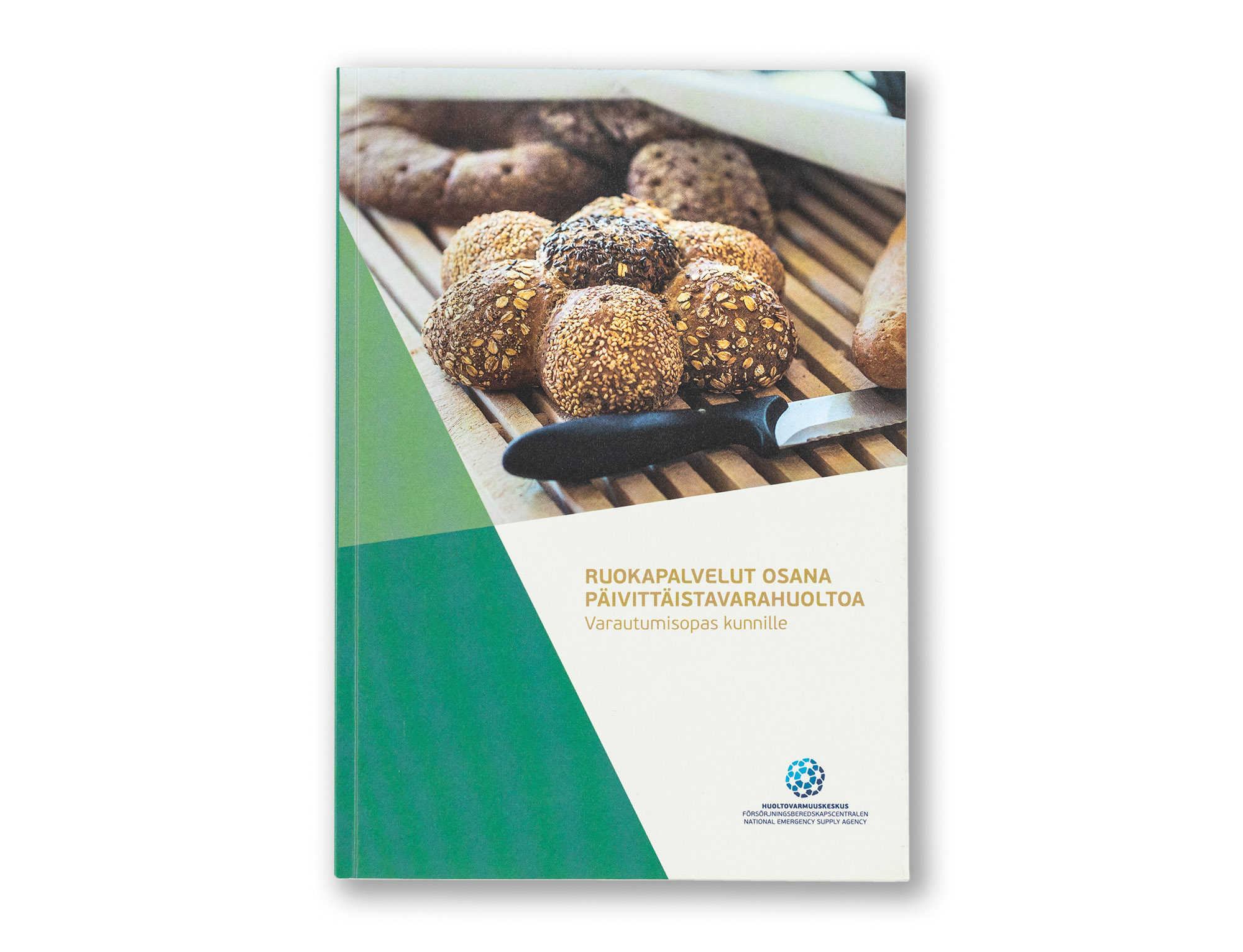
HVK Ruokapalveluopas [Food Service Handbook]

Concept of the publication, design and layout, charts, graphs and tables, photography, image adjustments and CMYK separations.
NESA is a Finnish state own organization that takes care security of supply and ensures a functioning society under all circumstances. This handbook is made for local authorities and communes to help preparing food services for citizens under any circumstances.
Because this is a practical handbook, I wanted to make it compact in size and easy to use. The publication contains a large number of charts, tables and diagrams. For the paper stock, we selected Munken Polar 120 g, an uncoated natural paper that feels pleasant both to the hand and the eye. The softcover features a soft-touch lamination that gives it a subtle textile-like feel. The primary colour is a natural forest green. The typography is set in NESA’s corporate typeface Beau Sans.
All photographs were taken by Juha Nenonen, who was also responsible for the design work and CMYK separations.
| Client | National Emergency Supply Agency NESA / Huoltovarmuuskeskus |
| Size | Portrait 175 × 248 mm |
| Content | 88 pages |
| Language | Finnish and Swedish (e-PDF version only) |
| Fonts | Beau Sans |
| Paper | Munken Polar 120 g by Arctic Paper |
| Binding | Sewn binding, soft cover with flaps and lamination |
| Printing | Offset + e-PDF |
| ISBN | 978-952-5608-37-3 printed |
| ISBN | 978-952-5608-38-0 PDF |