Art of Design

Production management, concept of the publication, design and layout, architectural and portrait photography, image adjustments and CMYK separations, and supervision of the printing process.
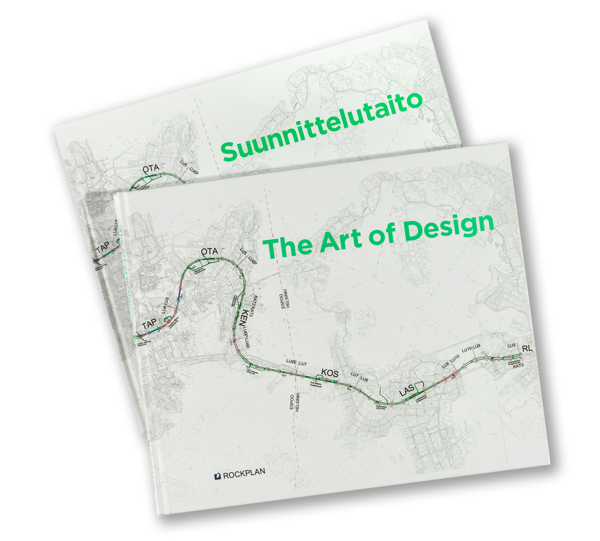
Rockplan is a Finnish engineering and design consultancy specialising in underground construction and subterranean spaces. This book offers an exceptional and unusually detailed look into different aspects of their design process and the challenges related to the field. The main emphasis is not on the texts themselves but on the visual material — illustrations and their captions. The book contains a large amount of photographs, sketches, tables, technical drawings and maps. The projects are presented and the texts written by Rockplan’s own experts.
Rockplan’s CEO, Jarmo Roinisto, had the vision and courage to commission this highly ambitious and unconventional coffee-table book. The entire project was a remarkably far-sighted and intelligent decision by the company. From the beginning, we wanted to create a publication that would be more than just corporate advertising — something genuinely valuable that the reader would want to keep on their bookshelf permanently. Art of Design is not merely a presentation of the company’s work; it also offers a deeper understanding of the field itself and of the wide range of world-class projects Rockplan has realised over the years. The book was distributed widely among Rockplan’s stakeholders. Is there a better way to promote a company?
On this book illustrator and graphic designer Milena Huhta collaborated with me on the typesetting and overall book concept. We selected a large landscape format with a hardcover binding. The generous page size made it possible to create visually rich spreads containing numerous smaller illustrations and captions, while also allowing large and highly detailed images to be presented effectively.
Tobias Frere-Jones’s brilliant Gotham typeface family was chosen because of its precision, beauty and convincing character. It is a typeface frequently used in political campaigns in the United States because it conveys trustworthiness and expertise. We wanted to use an energetic bright green PMS colour in the headlines and captions. Overall, the book contains a great deal of bright colour, which is rather unusual in this field. Juha Nenonen photographed many of the architectural images.
| Client | Rockplan Ltd |
| Size | landscape 245 × 300 mm |
| Content | 176 pages |
| Language | English and Finnish (separate editions) |
| Fonts | Tobias Frere-Jones / Gotham |
| Binding | Sewn binding, hard cover |
| Printing | Offset |