Art of Design

Concept of the publication, design / layout, architectural and portrait photography, image adjustments and CMYK-separations and supervision of the printing work.
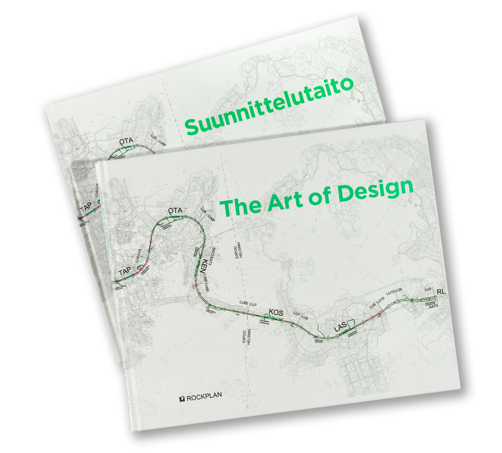
Rockplan is a Finnish design agency specializing in the underground construction and spaces. This book takes an exceptional closer look into different areas of designing process and possible challenges on the field. The main content is not the texts but in the visual material – illustrations and their captions. The book contains lots of photographs, sketches, tables, technical drawings and maps. The projects are presented and the texts are written by their own experts. Rockplan CEO Jarmo Roinisto had a vision and courage to order this highly ambitious and unusual coffee table book. The whole project was very long-sighted and wise decision from the company. For this book we wanted to make a book that is not advertisement but something more valuable, something that the receiver wants to keep in the bookshelf forever. Art of Design is not just promotion of the corporate work but it truly gives a deeper look on their field in general and of course on the vast variation on different world class projects they have realized during the past few years. Rockplan distributed this book widely to their stakeholders. Is there any better way to promote your company?
For the format we selected large landscape format with hard cover. For the large page size it was easy to build interesting spreads with many smaller illustrations and captions as well as to show very large and impressive images with lots of details.
Tobias Frere-Jones’ brilliant Gotham font family was used as it is very precise, beautiful and convincing. It is a font that many presidential candidates have used in their campaigns in US because it gives image that is often connected with trustworthiness and expertise. We wanted to use energetic bright green colour as PMS-ink in the headlines and captions. Overall there are lot of bright colours in this book which is quite unusual for the field. Juha took many of the architectural images and graphic designer and illustrator Milena Huhta was also along designing the book concept.
| Client | Rockplan Ltd |
| Size | landscape 245 × 300 mm |
| Content | 176 pages |
| Language | English and Finnish (separate editions) |
| Fonts | Tobias Frere-Jones / Gotham |
| Binding | Sewn binding, hard cover |
| Printing | Offset |