Author Archives: Bigg_Spla

  1. For Each Minute – Sixty-Five Seconds

    Leave a Comment

    Concept design, graphic design and typesetting.

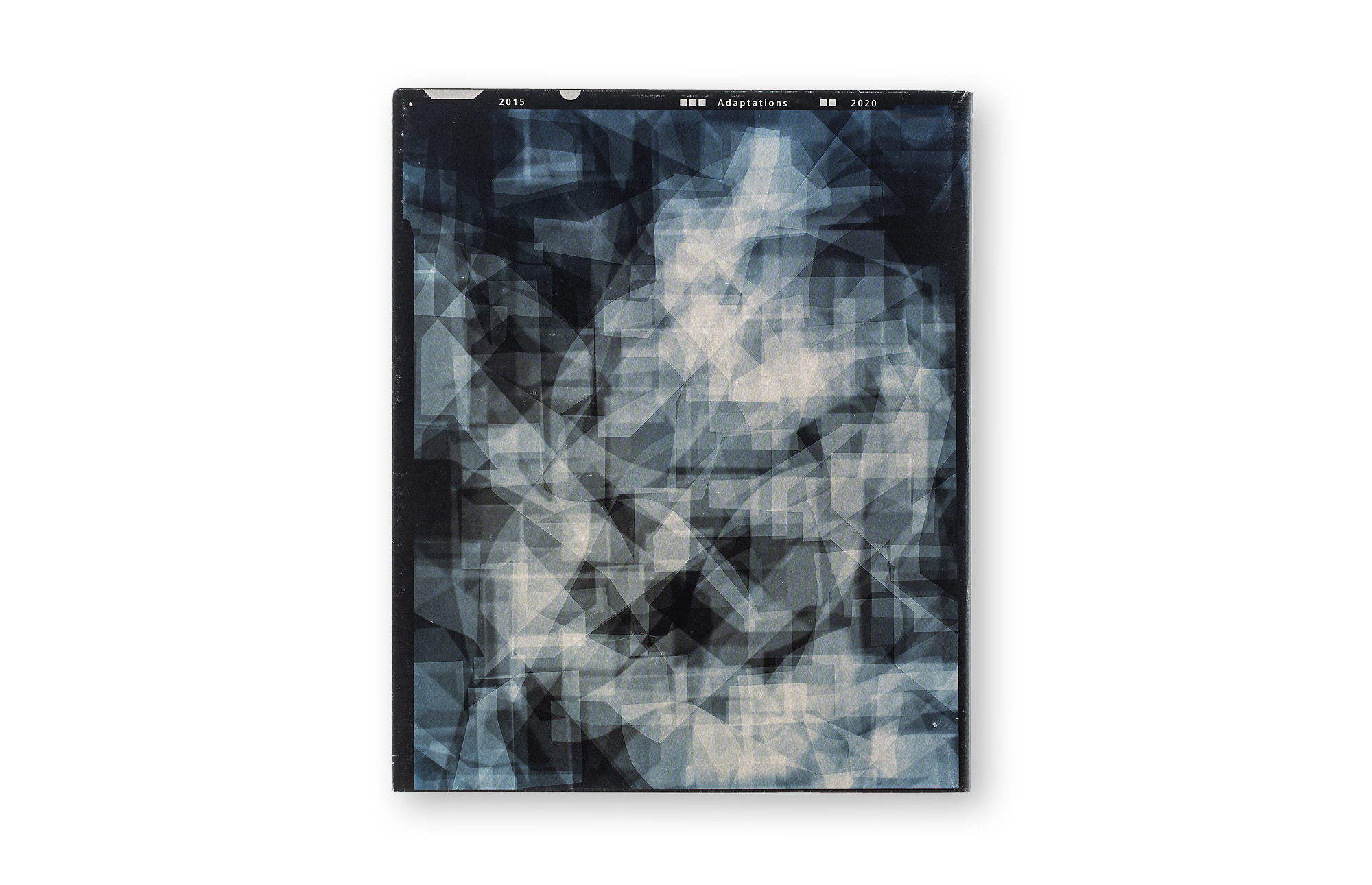
    For Each Minute – Sixty-Five Seconds is a monograph that presents works from Niko Luoma’s Adaptations series.

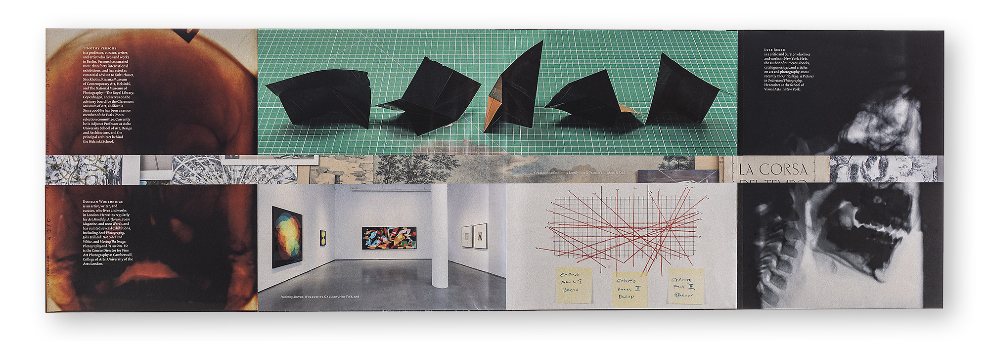
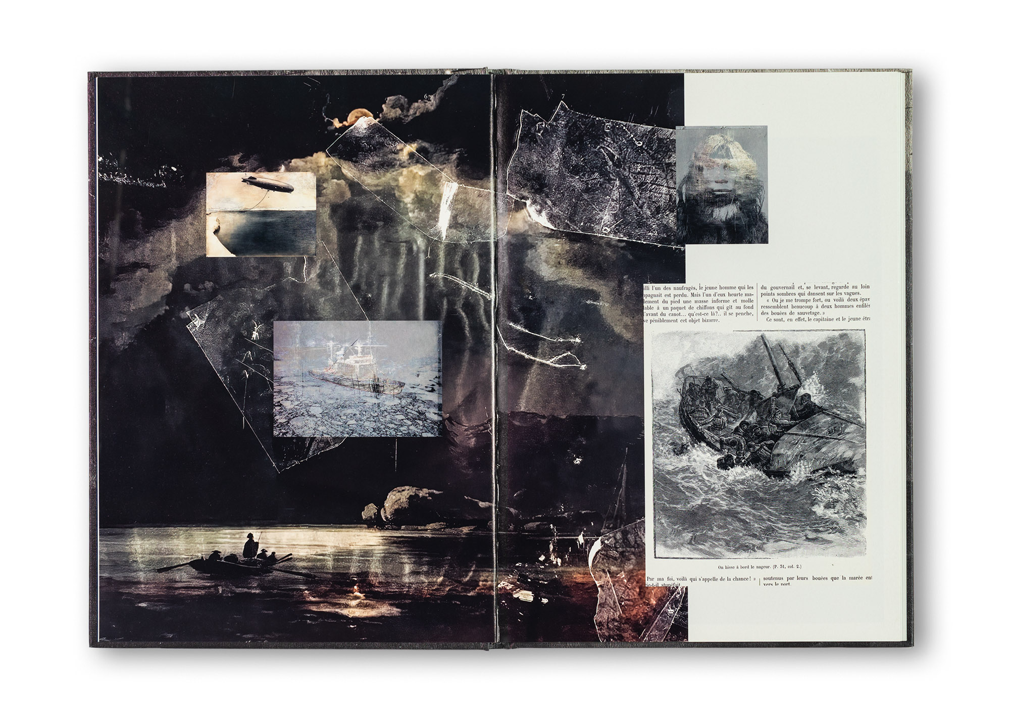
    The content paper of the book is the bulky and bright Arctic Volume HighWhite. All artworks are displayed on a white background, while a black background is used for the sketch pages. Spot varnish has been applied to the artworks to increase gloss and contrast. The book contains four foldout / gatefold spreads. Two of them open to one side only, while the other two open in both directions. The latter use a high-gloss spot UV varnish for effect. The text pages with reference images are printed on thin Munken Pure Rough in 1/1 black only. Thanks to the open spine, the spreads open beautifully and completely flat. The use of black thread in the binding is another special detail. It is a subtle element, but it suits this book perfectly.

    The book has a softcover with Munken Pure Rough paper printed in black ink only. The double-sided American-style dust jacket is wrapped around the Munken cardboard cover. It can be detached from the book and opened out as a poster. It has been printed with oxidation-drying inks on Italian Favini Lunar Mini Silver paper. The flaps of the dust jacket contain numerous sketches and archival images, and Mary Oliver’s poem The Uses of Sorrow serves as an introduction to the book. The dust jacket also contains the author’s introduction and three artist inscriptions. The inside of the dust jacket is a hidden gem that reveals a collage of inspirational images and objects carefully arranged on Luoma’s studio floor.

    Niko’s photographic works in this series are based on artworks by other artists, such as Pablo Picasso, Francis Bacon, Diego Velázquez, David Hockney, Edward Hopper, Henri Matisse, Irving Penn and Henri Cartier-Bresson, etc. Luoma has used these artworks as a starting point and created his own versions of them using his unique working method. These abstract photographs are created according to a precise pre-planned process involving hundreds of exposures on 4 × 5 inch film using a field camera. The working process is meditative and slow, and this sense of slowed time is also reflected in the title of the book, For Each Minute – Sixty-Five Seconds.

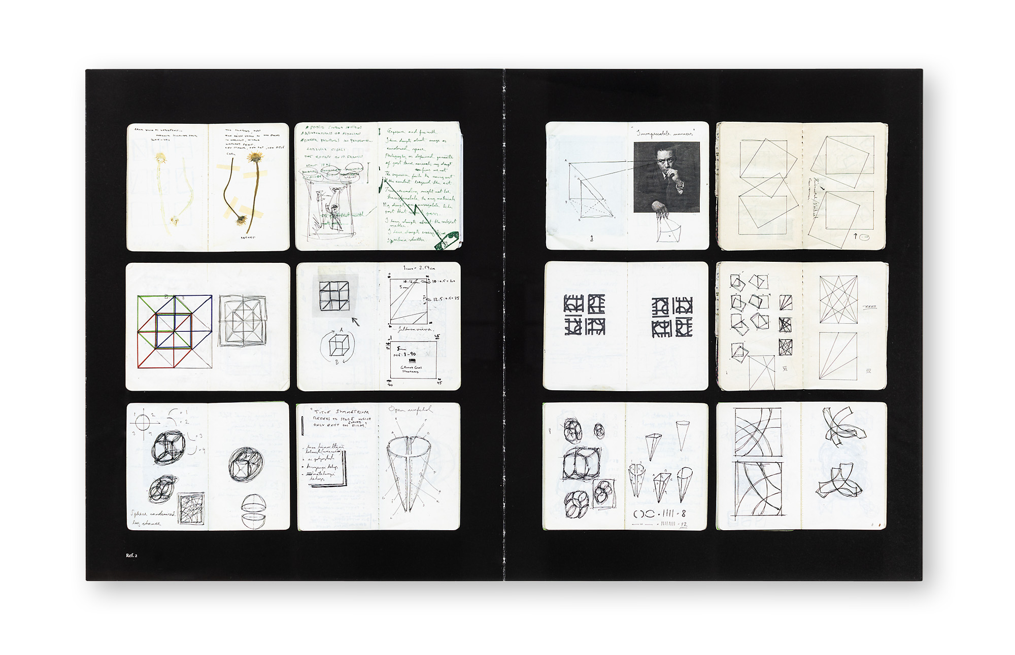
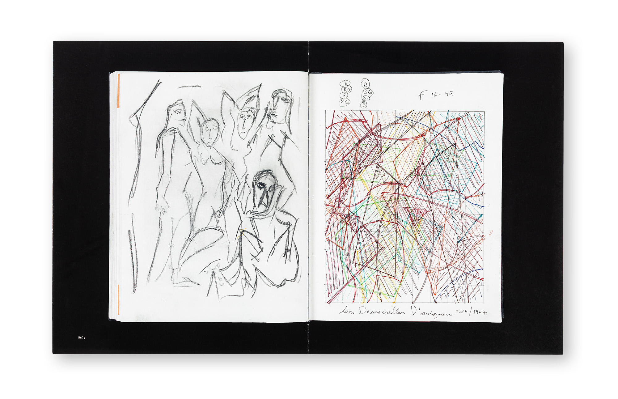
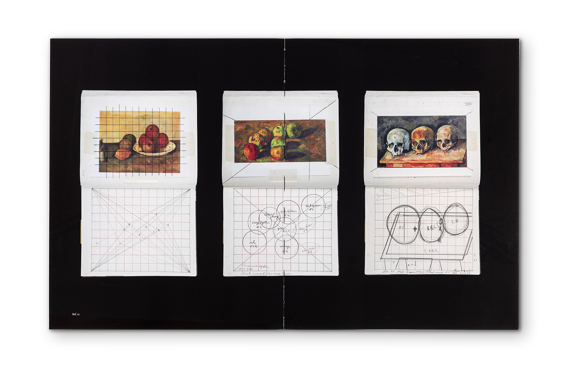
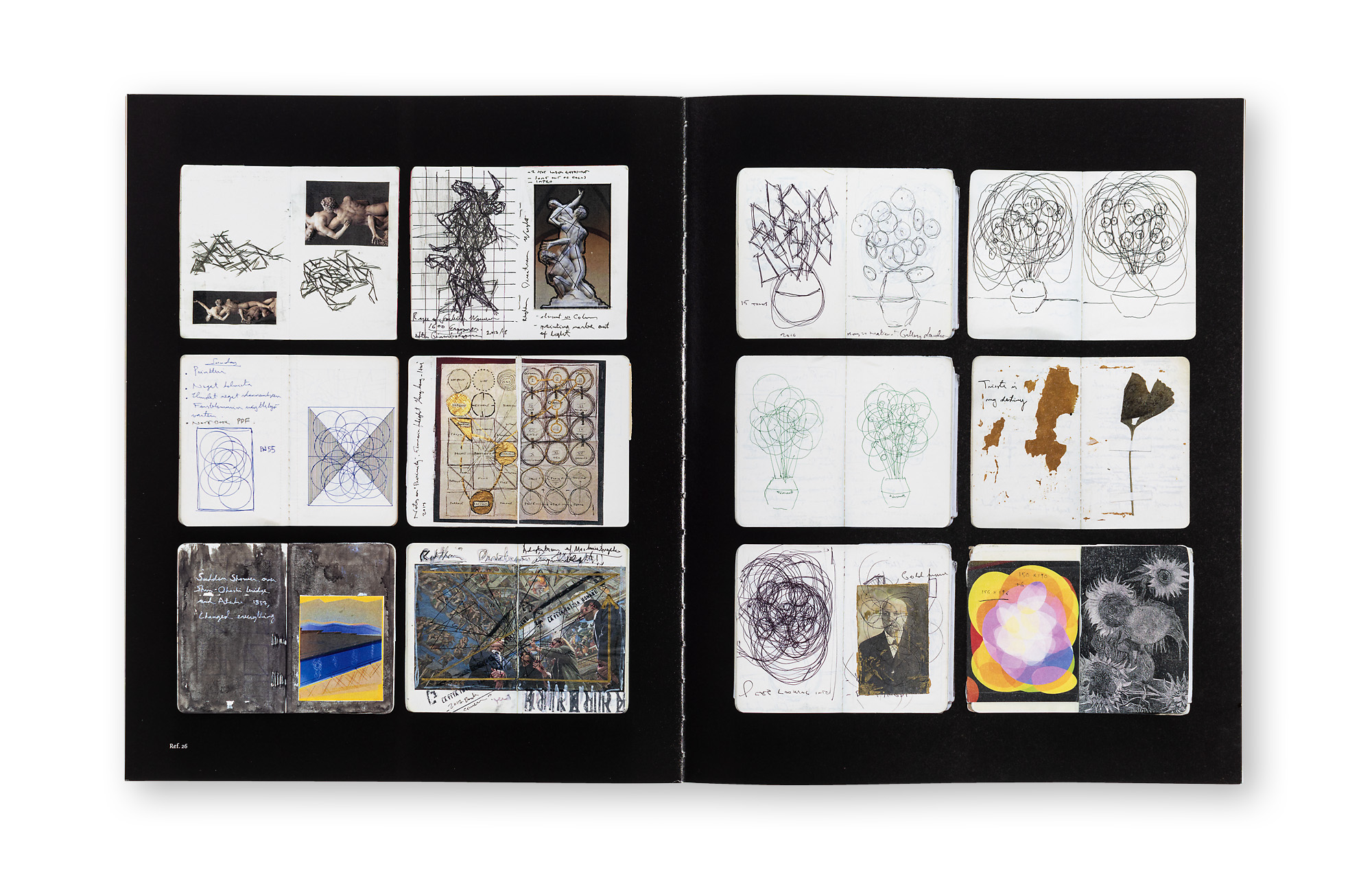
    In addition to the works from the Adaptations series, the monograph contains numerous sketches, reference images and spreads from the artist’s notebooks. The book includes an interview between Lyle Rexer and Niko Luoma, an essay by Duncan Wooldridge, and a foreword by Timothy Persons. Luoma’s own comments on his sketches, works and working process are placed at the end of the book.

    For Each Minute – Sixty-Five Seconds is one-of-a-kind photo book. The concept for this book emerged through many years of collaboration between Niko Luoma and Juha Nenonen. The aim was to create a monograph that incorporates elements of an artist’s book. It is full of meticulously considered details, and the printing quality is simply superb.

    ArtistNiko Luoma
    Concept designJuha Nenonen and Niko Luoma
    Graphic design and typesettingJuha Nenonen, Bigger Splash
    ReproductionsPetri Kuokka, Aarnipaja
    PublisherHatje Cantz, Berlin Germany
    SizePortrait 25 x 30,5 cm
    Content184 pages, 65 colour artworks, 72 workbook images and sketches, six B/W artworks (on text pages) and six reproduced artworks of other artists
    LanguageEnglish
    TextsNiko Luoma, Timothy Persons, Lyle Rexer and Duncan Wooldridge
    TypefaceDolly Pro and Auto Pro by Underware
    PaperArctic Volume Highwhite 150 g, Munken Pure Rough 90 g (text pages), Favini Lunar mini silver 120 g (dust-jacket) and Munken Pure 400 g (cover)
    BindingSwiss softcover with black thread. American dust-jacket poster as cover
    PrintingUV offset 4/4, text pages 1/1 (black), FM- screen, spot varnish on artworks and glossy UV varnish as effect on 8 pages
    Printing and bindingLivonia Print, Riga Latvia
    Year2021
    ISBN978-3-7757-4689-2
    For Each Minute, Sixty-Five Seconds
  2. Museum Meditations

    Leave a Comment

    Concept of the publication, design and layout, editing and sequencing, and production management.

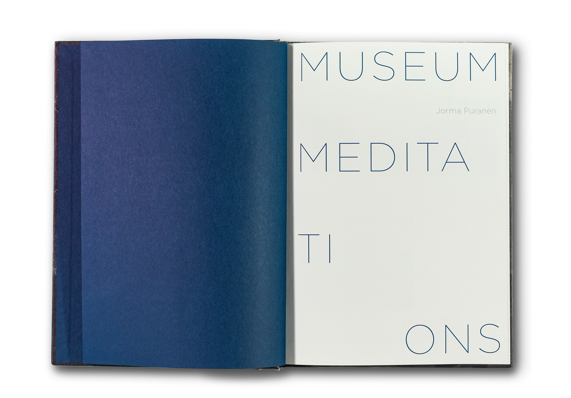
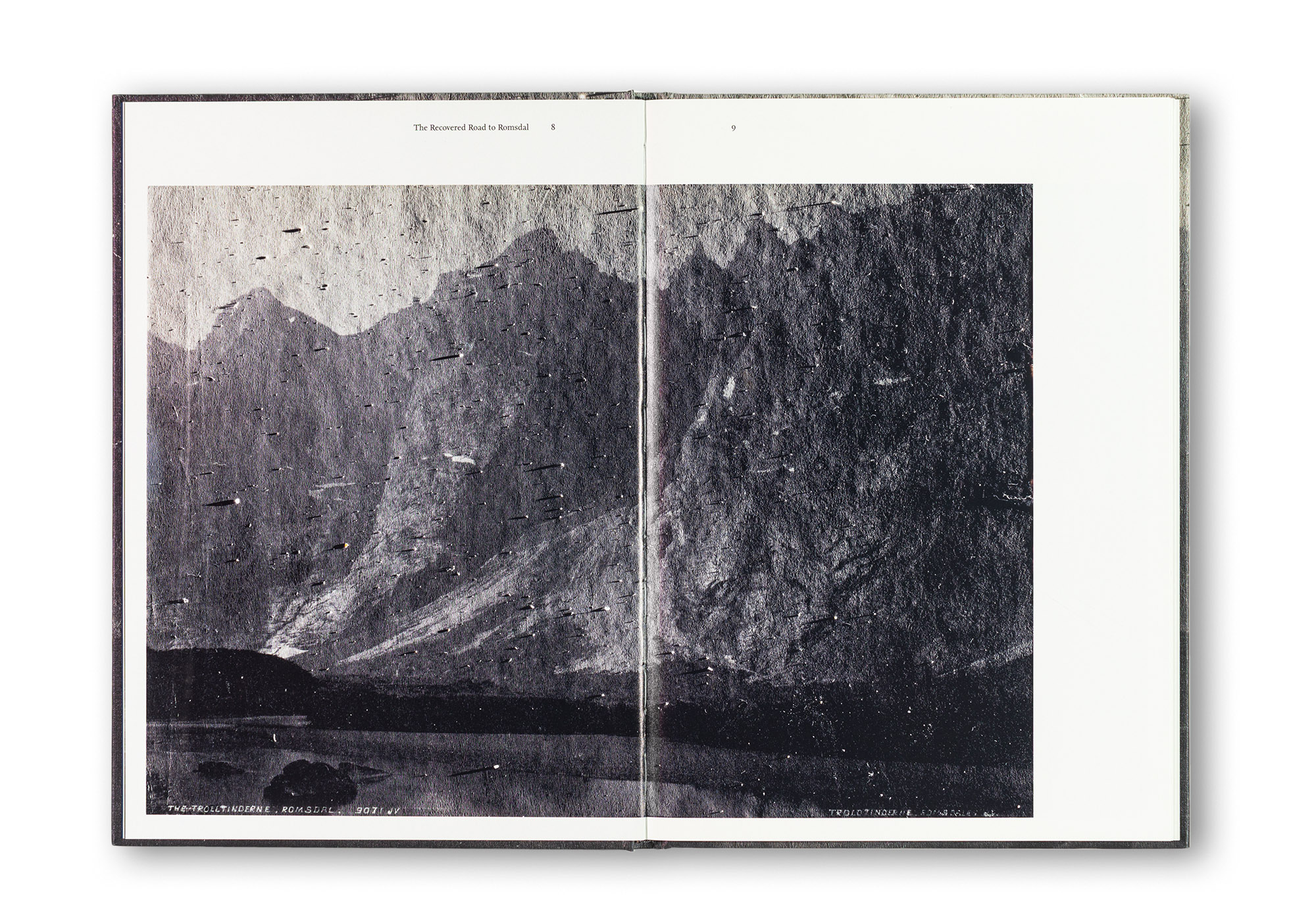
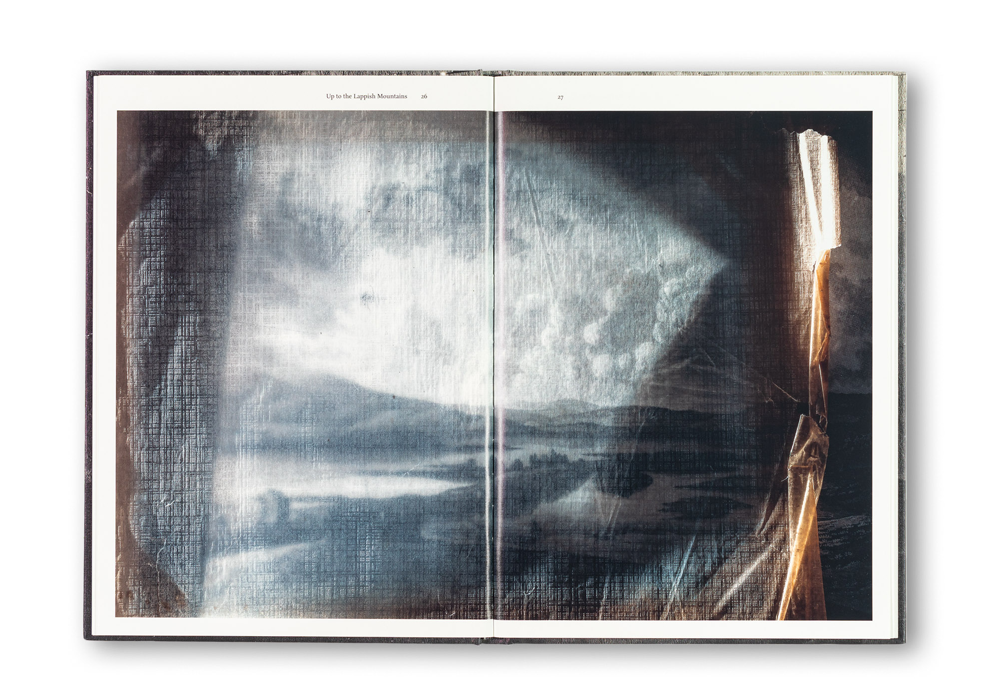
    Museum Meditations is a small publication made in conjunction with Jorma Puranen’s exhibition at the Aboa Vetus Ars Nova Museum in Turku, Finland.

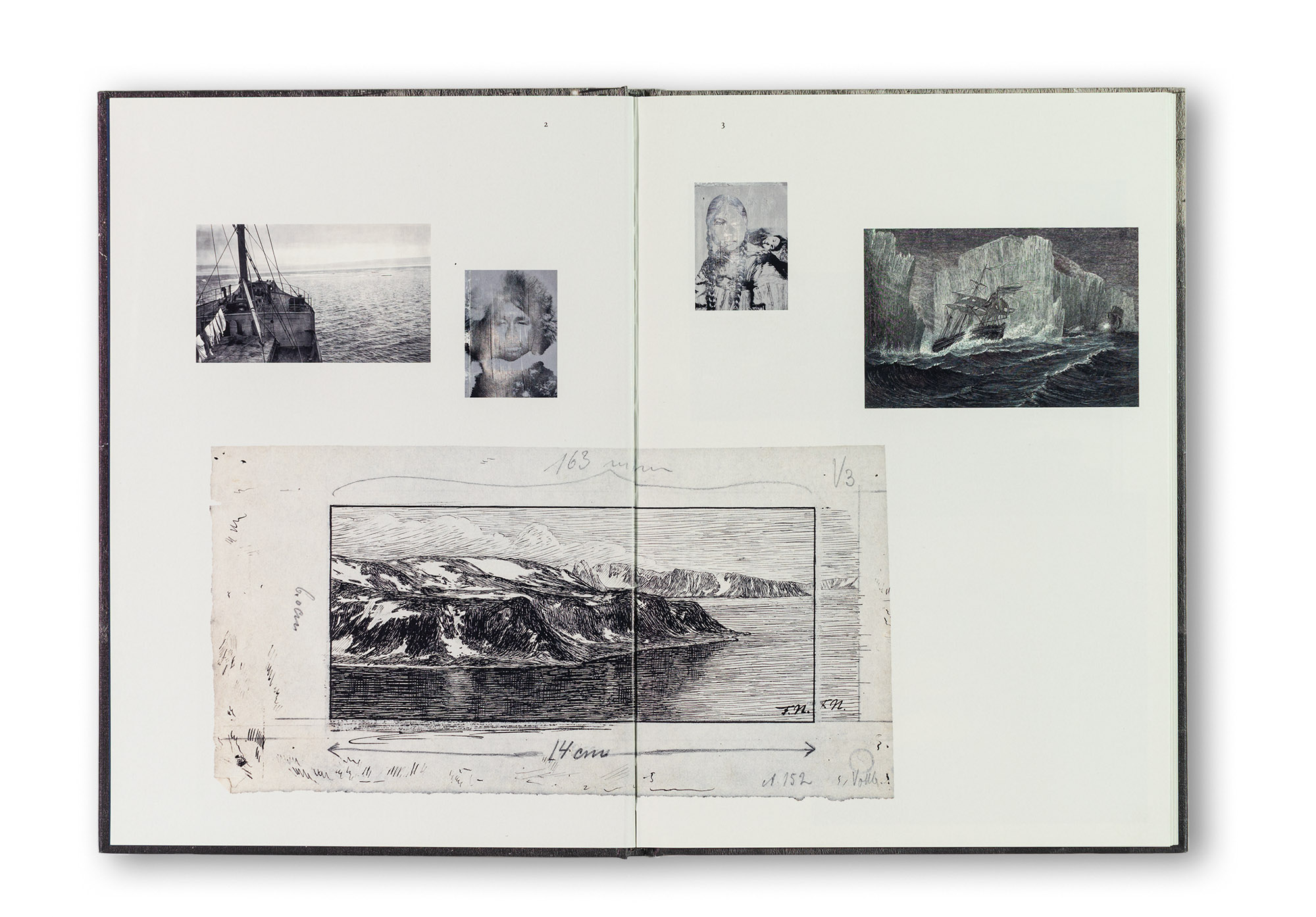
    For this book I used bulky yellowish Arctic Volume that has a nice uncoated feeling but still allows a superb printing quality. Although the paper is already warm in tone it still accepts a warm printed background tone on every page. As a contrast to that I used dark blue Geltex Silks for the front and end papers. The book begins with a three spread collage-type selection of small illustrations and photographs followed by larger photographic works.

    The format of the book is quite close to A4 size, while still being slightly smaller and shorter. Although it is so close to the most commonly used paper format, the feeling of the book is unusual; it feels surprisingly narrow and tall.

    The essay Path North by Alistair Hicks is set in Nexus Serif, a typeface with a relatively large point size. It is both beautiful and easy to read.

    ArtistJorma Puranen
    PublisherJorma Puranen / Aboa Vetus Ars Nova Museum Turku
    Size200 × 280 mm
    Content64 pages / 40 images
    LanguageEnglish and Finnish
    TextsAlistair Hicks
    FontsNexus serif Pro, Nexus Sans Pro and Gotham Thin
    PaperArctic Volume Ivory 150 g,
    front and end papers: Geltex silks 115 g
    BindingSewn binding, hard cover
    PrintingUV offset printing
    ISBN978-952-5820-23-2

  3. Observing Eye

    Leave a Comment

    Concept of the publication, design / layout, supervision of the printing work and taking care of the production.

    Observing Eye is the third monograph by Finnish visual artist Sanna Kannisto. The book focuses on Sanna’s bird series, photographed in Finland, Russia, Italy and Costa Rica.

    Sanna’s working method is highly distinctive. She is an artist whose work occupies an intriguing space between art and nature photography. Her works are exhibited in galleries and museums, yet her subjects are familiar from traditional nature photography. For this project, she collaborated with scientists working at bird observatories and research stations. The birds are captured for scientific research and ringing, and after the research procedures have been completed, Sanna photographs them in her small portable field studio.

    In the white plexiglass studio, the birds are temporarily isolated from their natural habitats. Sanna pays close attention to the composition of her photographs: she carefully plans and selects all attributes, props, branches and other elements, and sometimes spends considerable time compositing the images later in Photoshop. The final result is partly portrait, partly still life, and partly nature photography.

    In some images, she uses black curtains on the left and right sides of the studio, giving the photographs a theatrical stage-like appearance. The bird — sometimes several birds — is unquestionably the protagonist of the scene. What distinguishes these photographs from conventional nature photography is the close proximity. There is always an intimate encounter between the photographer and the bird: the bird observes and reacts to the photographer, and vice versa. It is rare to see a bird from such a close distance in real life. We wanted to take advantage of this and keep the photographs as large as possible, so that the birds in the book appear close to life size.

    Most of the birds she photographs are migratory birds travelling north or south during spring and autumn. One detail that is not immediately visible in the images is the rings on the birds’ legs. These are not just any wild birds: they are part of scientific research and have, in a sense, been “named”. They remain free birds, yet they have also become part of a scientific culture. The titles of the works refer to this as well. Usually the works are named after the Latin species names. Sometimes Sanna uses another type of title that may be more poetic or refer to something outside the image itself, such as Silent Spring or Approach of Winter.

    For the book, we wanted a classic cloth cover. We selected a pale green Brillianta fabric with a pleasant natural haptic quality. As the paper stock, we used bulky Arctic Volume paper, which offers excellent print quality while remaining soft and pleasant to the eye and hand.

    We published and produced the first edition of the book ourselves and arranged international distribution through Hatje Cantz. After the first edition sold out, Hatje Cantz approached us about producing a second edition. For the second edition, the cover material was changed to Geltex.

    Observing Eye was shortlisted for the Photobook of the Year 2020 prize in Finland, and it received a silver medal at the Deutscher Fotobuchpreis (German Photo Book Prize) 20/21 in the category Conceptual Artistic Photo Book.

    ArtistSanna Kannisto
    PublisherSanna Kannisto / Hatje Cantz
    SizePortrait 250 × 290 mm
    Content144 pages, including one 8-page gatefold
    76 images
    LanguageEnglish
    TextsBarbara Hofmann-Johnson
    FontsMinion Pro and ITC Espirit
    PaperArctic Volume white 150 g, front and end papers: Geltex silks 115 g
    BindingSewn binding, hard cover. Brillianta fabric cover with debossed image on the front cover.
    PrintingUV offset
    ISBN978-3-7757-4791-2
  4. Villa Frenckell

    Leave a Comment

    Concept of the publication, design / layout, photography, image adjustments and CMYK-separations, supervision of the printing work and making Swedish and English language editions.

    This book tells the story of Villa Frenckell, an iconic building in Helsinki now owned by Cargotec. It presents both the history of the house itself and the story of the family that once owned it, as well as how the property eventually came into the possession of Cargotec.

    The engaging text is written by Rose-Marie Peake. The book contains a wealth of beautiful illustrations, historical material and recent photographs. The contemporary photographs were taken by Juha Nenonen. The image processing and colour separations were also carried out by Juha Nenonen. The book was produced in three language editions: Finnish, Swedish and English.

    The book is a hardcover with French binding and a bookmark ribbon. Two paper stocks were used: the main content is printed on uncoated Munken Lynx 130 g by Papyrus, while the appendices are printed on coffee-brown Colorit 120 g by Antalis. As one might expect from a historical publication, the book also includes extensive reference material at the end: notes, a bibliography and list of sources, appendices, and an index. I truly enjoy working with this kind of material.

    ClientCarcotec Oyj
    SizeLandscape 225 × 285 mm
    Content200 pages
    LanguageEnglish, Finnish and Swedish (separate editions)
    TextsRose-Marie Peake
    PaperMunken Lynx 130 g by Arctic Paper / Papyrus + colorit by Antalis
    BindingHard cover, French binding. Foil embossing.
    PrintingOffset
  5. The House of Poets

    Leave a Comment

    Concept, typesetting and visual design.

    Timo Kelaranta is one of the best-known Finnish photographic artists. He became widely known for his abstract black-and-white photographs. He has also been a great personal influence and teacher to me, and it was a great honour to design this book.

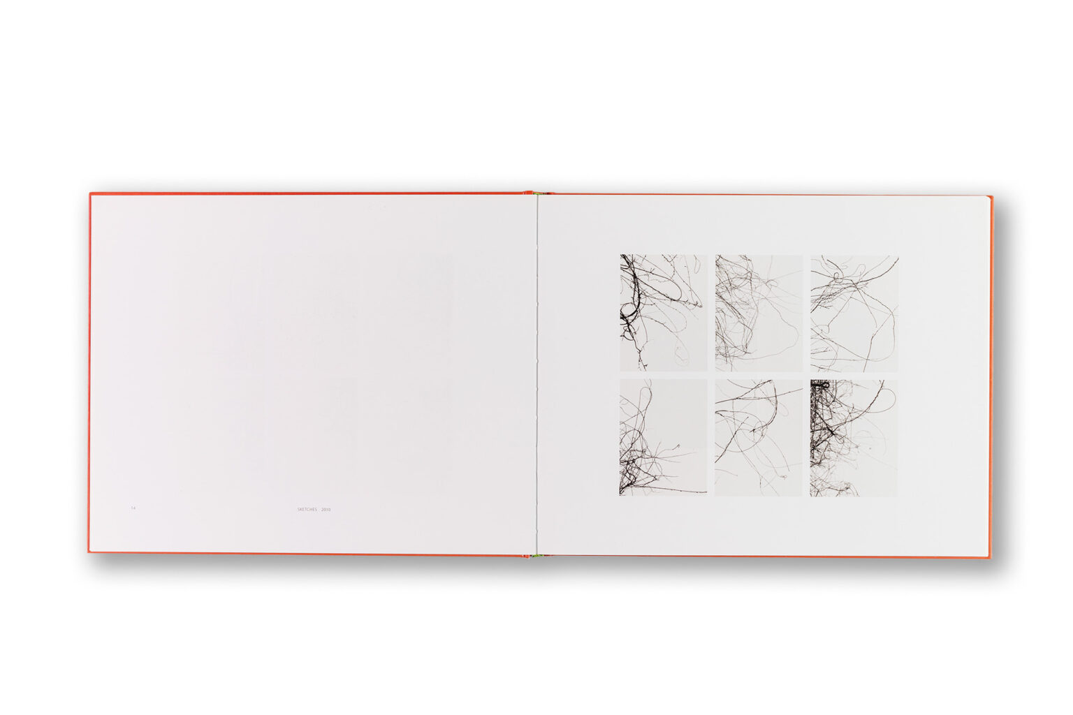
    In recent years, Timo has moved into working with colour — immediately diving into the deep end. In his homestudio, he works with coloured papers and cardboards, bending and rolling them into sculptural compositions from which he constructs still lifes that he then photographs, often using natural light. The resulting images are abstract, characterised by the interplay of light and shadow and by vivid colours and colour combinations, often featuring bright oranges and greens. In addition to the paper constructions, Timo has also created still lifes using coloured threads, and naturally his practice still includes black-and-white and grey abstract compositions as well.

    Timo works serially, and the images resemble a symphonic theme with variations. His working method is highly intuitive and emotional, and the images are deeply poetic. Small series emerge within larger series. For this reason, we decided to present many of the works in small scale, side by side and layered within grid-based layouts. The book also includes larger full-page images. Spot-varnish was used on the reproductions to enhance the colours and contrast. LensCulture describes Timo’s photographs as follows: “This aptly named photobook is filled with visual poetry, simplicity of style, and the craft of a master. The energy of the magical pictures derives from a combination of play and experimentation.”

    At the beginning of the book there is a foreword by Timothy Persons. In the text Friction and Spark, Timo reflects on his own working process and artistic practice. The book also includes a text written by Timo’s wife, Auli, which has the character of a personal letter. For this reason, I wanted to separate it from the rest of the content as a booklet-like insert bound into the book and printed on uncoated paper.

    In the index at the end of the book, all the images are listed as small thumbnail reproductions accompanied by artwork information. The book was published by the German publisher Kehrer Verlag.

    ArtistTimo Kelaranta
    PublisherKehrer Verlag Germany
    SizeSize landscape 300 × 240 mm
    Content116 pages / 106 colour illustrations
    LanguageEnglish
    TextsTimo Kelaranta, Auli Leskinen, Timothy Persons
    BindingSewn binding, hard cover
    ISBN978-3-86828-517-8
  6. Avannaa

    Leave a Comment

    Visual design together with Patrik Söderlund, editing and sequencing.

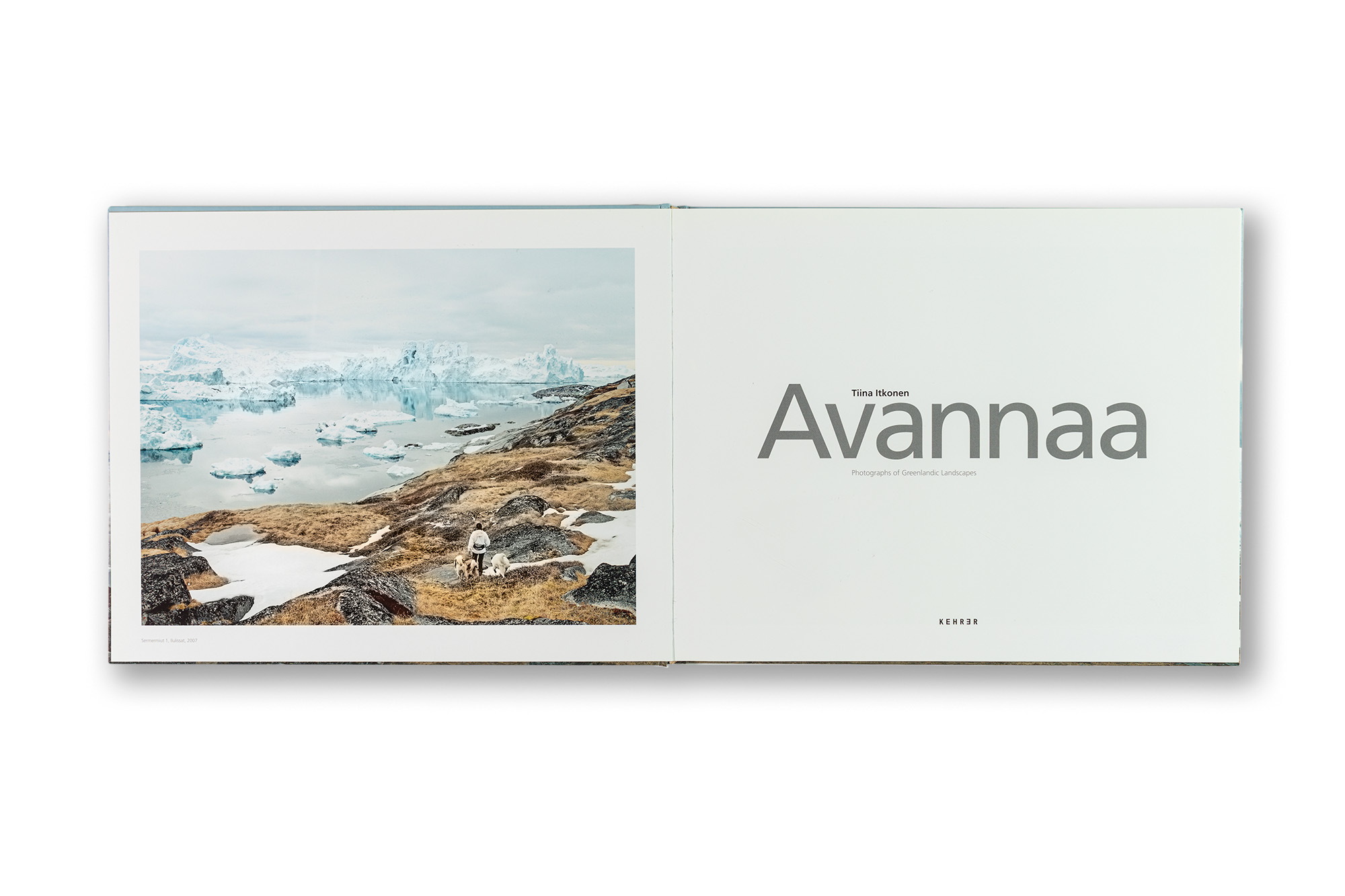
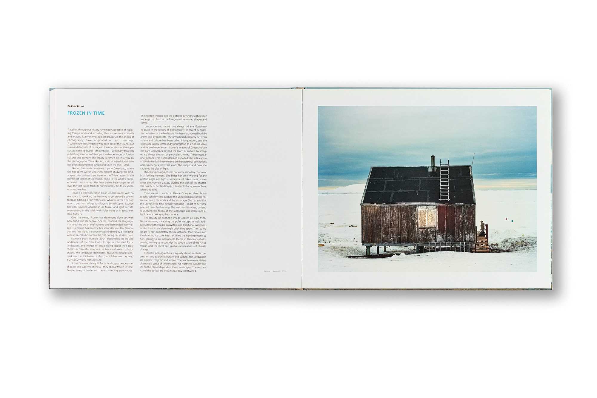
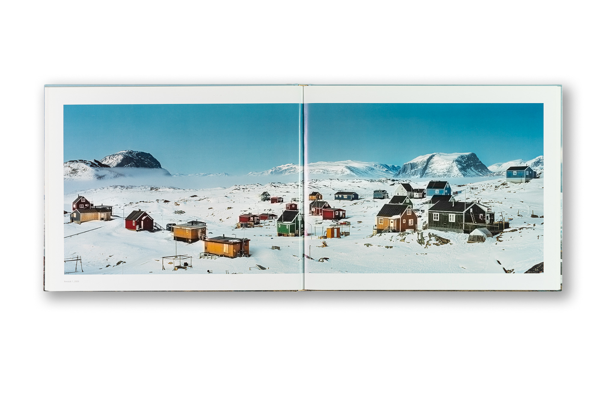
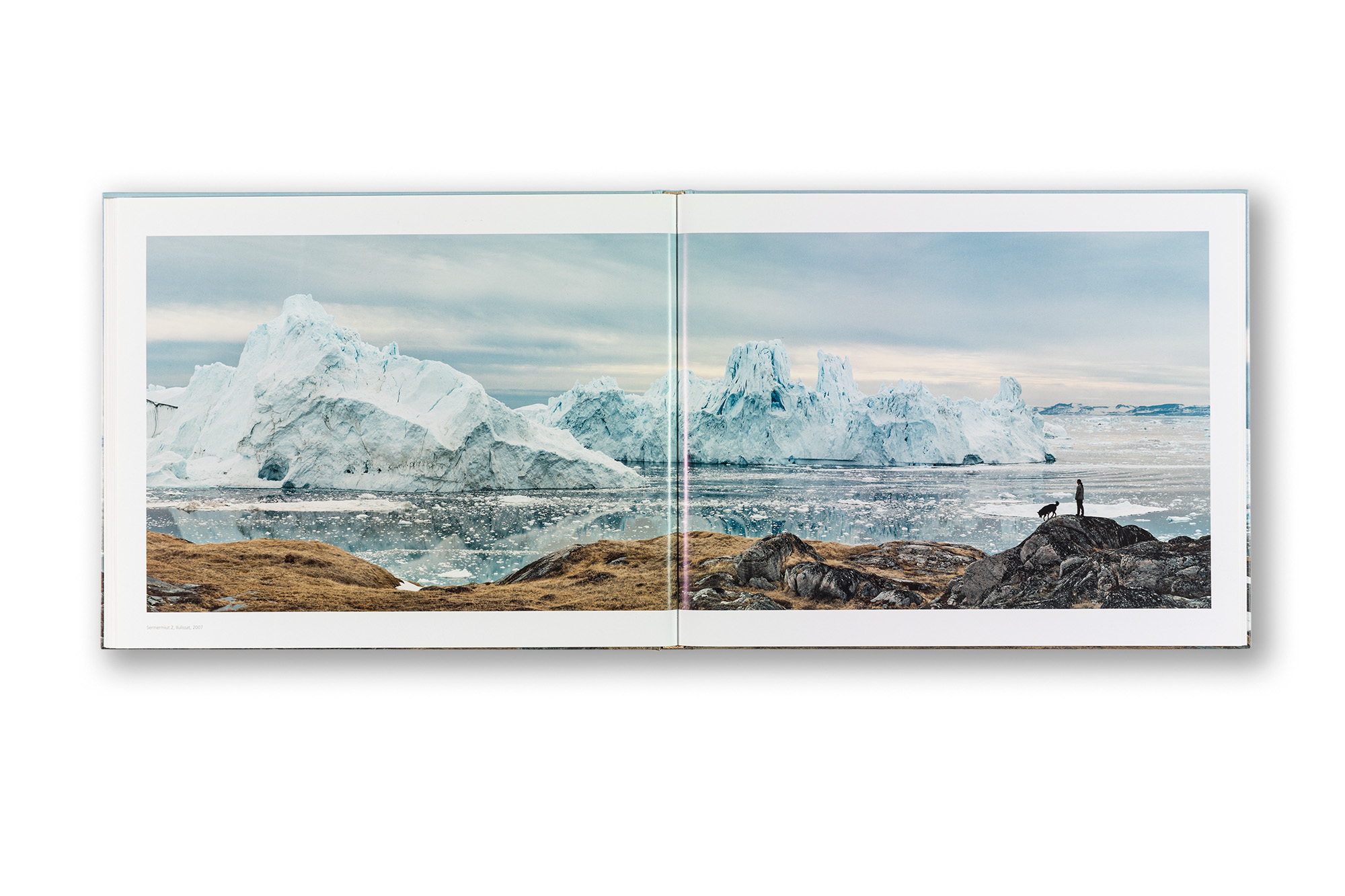
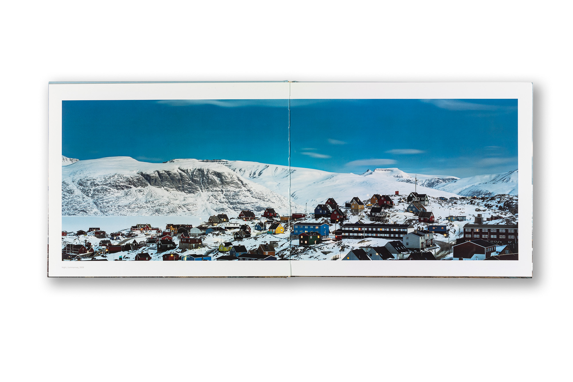
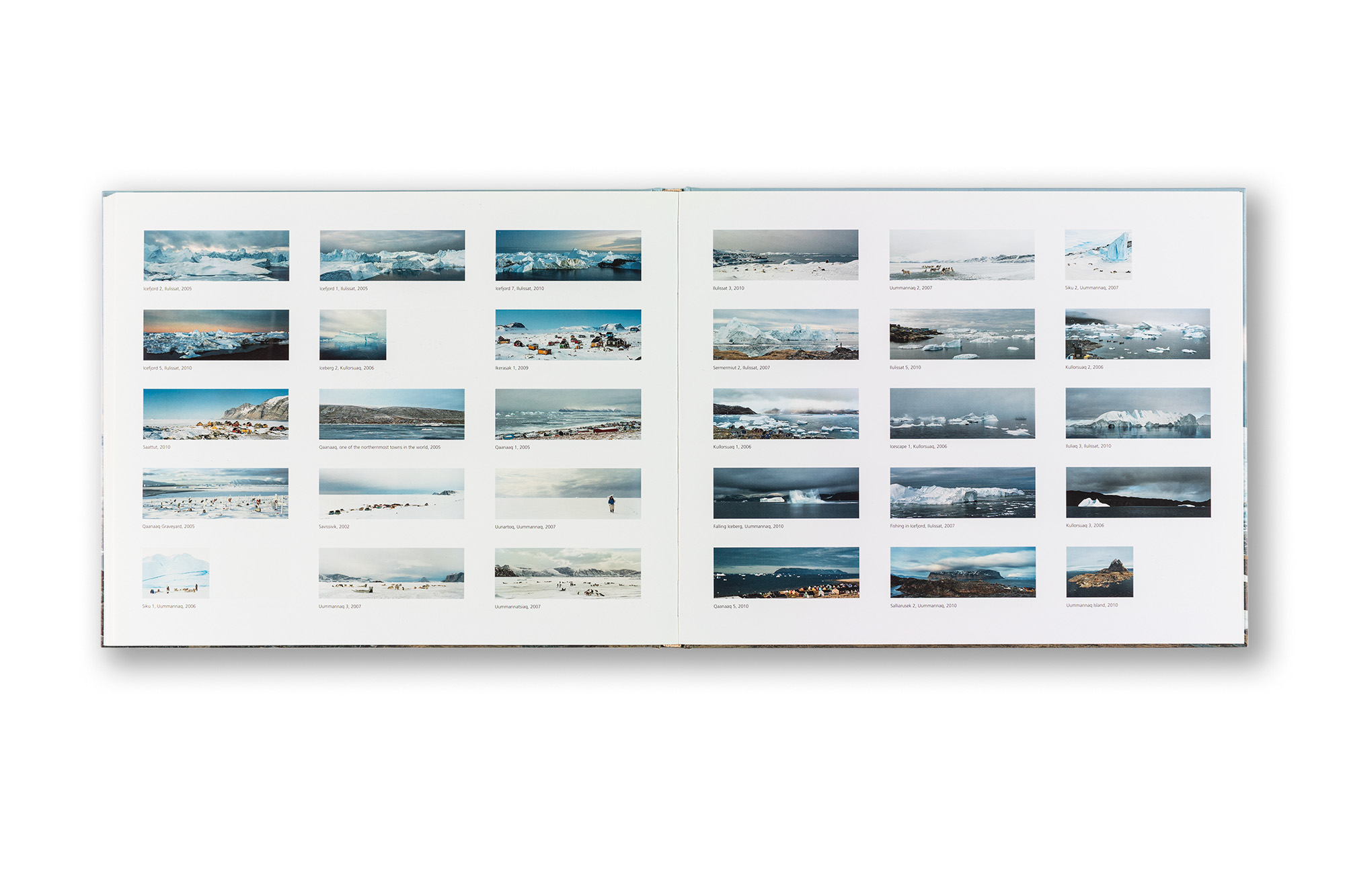
    Tiina Itkonen is a Finnish photographer best known for her photographs taken in Greenland. This was already the second book I designed for Tiina. Avannaa contains stunning high-quality panoramic photographs of the landscapes and people of Northern Greenland.

    In Tiina’s photographs, blue skies, snow and ice seem to glow everywhere. Villages, people, dogs, glaciers and icebergs appear in astonishing light at different times of the day. During the daytime the light can be extremely harsh, while in the evenings and twilight it becomes soft and almost painterly.

    Wide panoramic photographs are challenging in relation to the book format. Landscape formats in general present many challenges in books, but in this case the horizontal format was almost a necessity. Patrik Söderlund began the concept design of the book, while I completed the final design, doing extensive work particularly with the image sequencing. I wanted to create a continuous flow of full-spread images using 20 mm margins. This rhythm is occasionally interrupted by individual full-page photographs.

    This is very much a photographer’s photobook — one that does not attempt to impress as a book object, but instead trusts the images and the subject matter, allowing them to speak for themselves. One of the challenges was how to organise the continuous stream of images so that the photographs would not begin to compete with one another. This was approached by placing similar situations and images consecutively, while at the same time allowing them to form a constantly evolving and changing visual flow — somewhat in the same way as in nature itself. The photographs do not form one unified narrative, but they possess a natural rhythm and cycle.

    The book contains two essays: The Intimate Far North by anthropologist Jean-Michel Huctin and Frozen in Time by Pirkko Siitari, who was at the time the director of the Museum of Contemporary Art Kiasma in Helsinki.

    The first edition was published by the German publisher Kehrer Verlag and is now sold out. A new edition is currently in preparation and will be self-published by Tiina Itkonen.

    ArtistTiina Itkonen
    PublisherKehrer Verlag Germany
    SizeLandscape 300 × 240 mm
    Content104 pages / 45 images
    LanguageEnglish
    TextsJean-Michel Huctin, Pirkko Siitari
    BindingSewn binding, hard cover
    ISBN978-3-86828-512-3
  7. And Time Is No Longer an Obstacle

    Leave a Comment

    Concept and graphic design of the publication.

    Niko Luoma’s first monograph presents his unique abstract analogue photography. The book consists of four bodies of work: Motives, Cronos, Kairos and Symmetrium.

    The book presents Niko’s works in a simple and elegant way without becoming just another “American-style photobook”. The aim was to create a minimalistic book with a subtle twist. Smaller images are placed low on the page — a very small detail that nevertheless makes a significant difference and gives the book a distinctive character. The sequencing also works particularly well. John Downer’s Vendetta typeface contains many beautiful small details. It has a unique character and works perfectly with the overall concept of the book.

    A detail from the work Symmetrium #2 fills the entire dust jacket. It is a luminous image that flickers with the complementary colours red and green. Beneath the dust jacket, the hardcover is matte black with glossy spot varnish on the typography, while the endpapers are mid-grey. I love this combination.

    The book was published by Hatje Cantz.

    ArtistNiko Luoma
    PublisherHatje Cantz
    Size250 × 305 mm
    Content136 pages / 60 images
    LanguageEnglish
    TextsLyle Rexer, Daniel Marzona and Timothy Persons
    FontsJohn Downer’s Vendetta by Emigre
    PaperGalaxi Keramik 170 g
    BindingSewn binding, hard cover with dust jacket
    ISBN978-3-7757-3339-7

  8. Art of Design

    Leave a Comment

    Production management, concept of the publication, design and layout, architectural and portrait photography, image adjustments and CMYK separations, and supervision of the printing process.

    Rockplan is a Finnish engineering and design consultancy specialising in underground construction and subterranean spaces. This book offers an exceptional and unusually detailed look into different aspects of their design process and the challenges related to the field. The main emphasis is not on the texts themselves but on the visual material — illustrations and their captions. The book contains a large amount of photographs, sketches, tables, technical drawings and maps. The projects are presented and the texts written by Rockplan’s own experts.

    Rockplan’s CEO, Jarmo Roinisto, had the vision and courage to commission this highly ambitious and unconventional coffee-table book. The entire project was a remarkably far-sighted and intelligent decision by the company. From the beginning, we wanted to create a publication that would be more than just corporate advertising — something genuinely valuable that the reader would want to keep on their bookshelf permanently. Art of Design is not merely a presentation of the company’s work; it also offers a deeper understanding of the field itself and of the wide range of world-class projects Rockplan has realised over the years. The book was distributed widely among Rockplan’s stakeholders. Is there a better way to promote a company?

    On this book illustrator and graphic designer Milena Huhta collaborated with me on the typesetting and overall book concept. We selected a large landscape format with a hardcover binding. The generous page size made it possible to create visually rich spreads containing numerous smaller illustrations and captions, while also allowing large and highly detailed images to be presented effectively.

    Tobias Frere-Jones’s brilliant Gotham typeface family was chosen because of its precision, beauty and convincing character. It is a typeface frequently used in political campaigns in the United States because it conveys trustworthiness and expertise. We wanted to use an energetic bright green PMS colour in the headlines and captions. Overall, the book contains a great deal of bright colour, which is rather unusual in this field. Juha Nenonen photographed many of the architectural images.

    ClientRockplan Ltd
    Sizelandscape 245 × 300 mm
    Content176 pages
    LanguageEnglish and Finnish (separate editions)
    FontsTobias Frere-Jones / Gotham
    BindingSewn binding, hard cover
    PrintingOffset
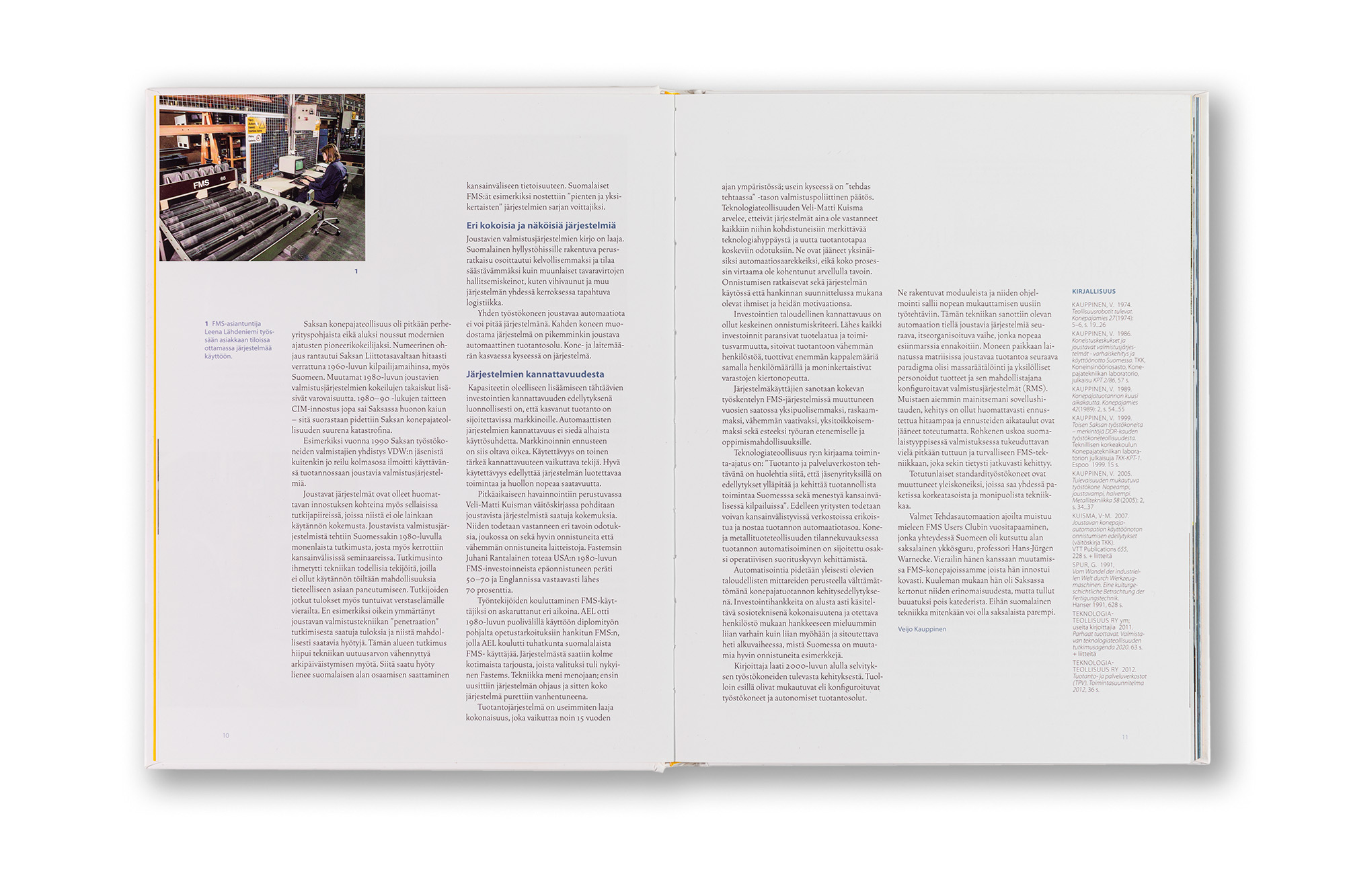
  9. Fastems FMS Taydellä teholla

    Leave a Comment

    Project management, concept and graphic design, layout, photo adjustments and CMYK separations, and supervision of the printing process.

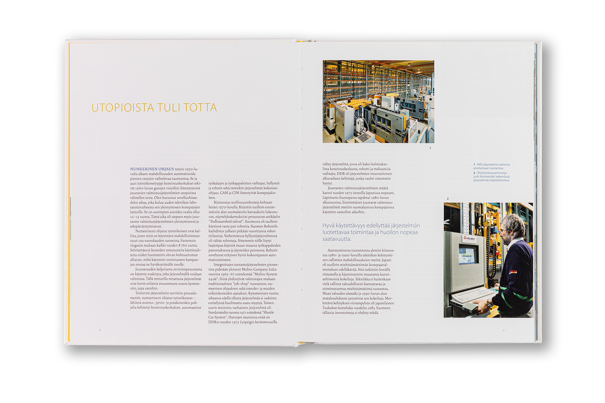
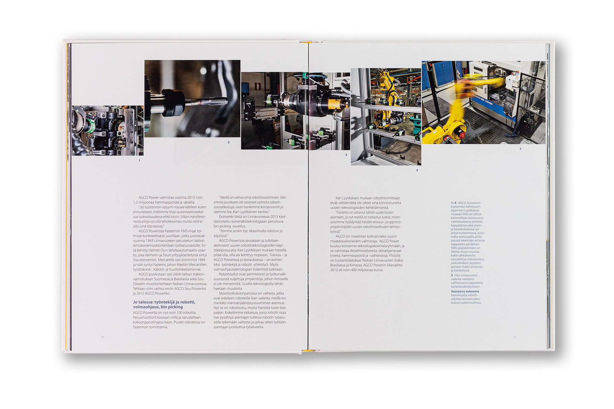
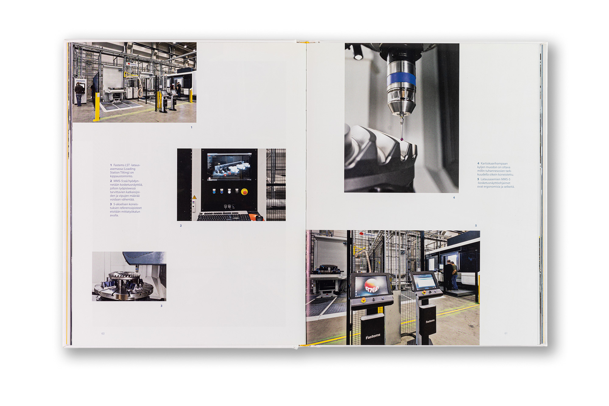
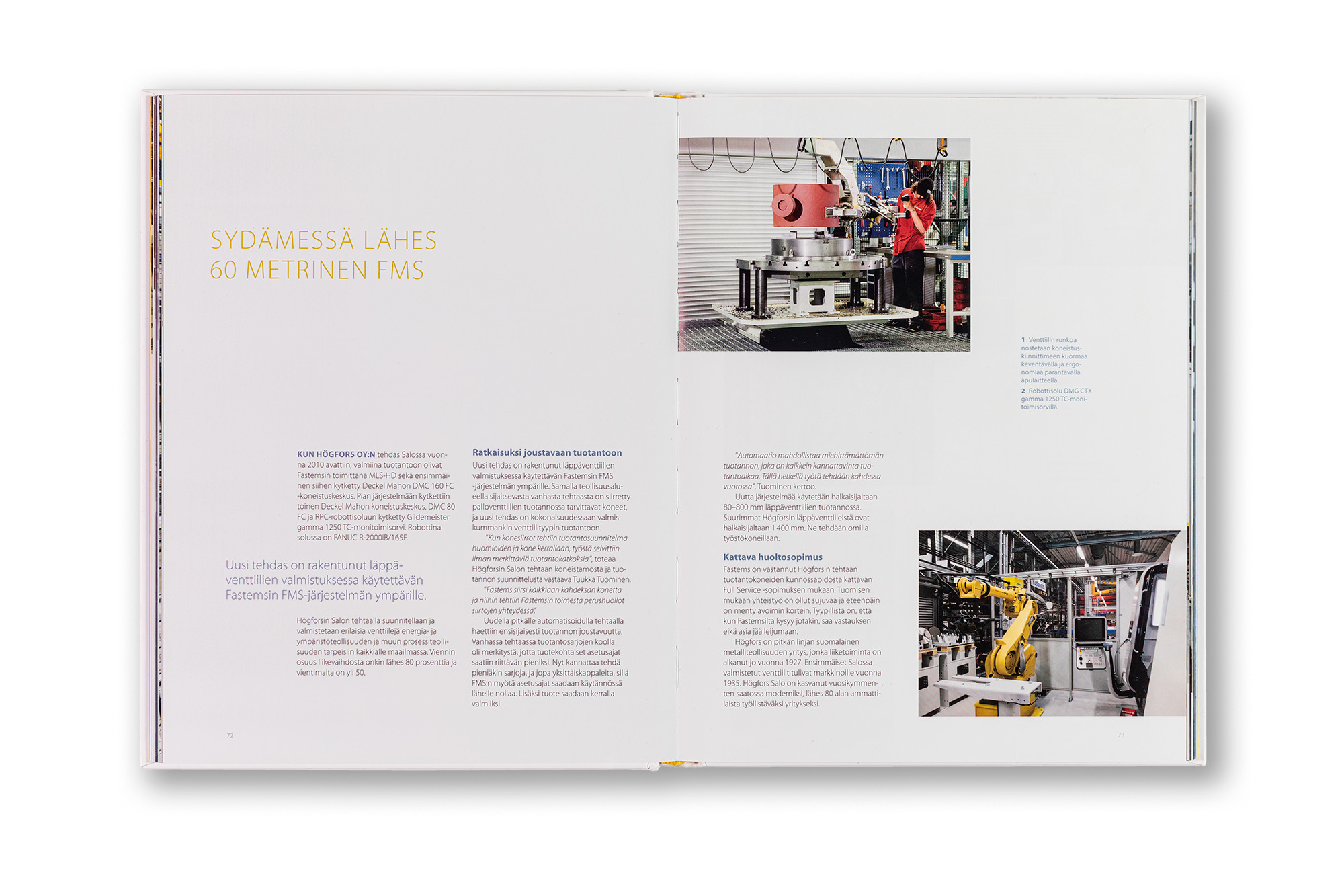
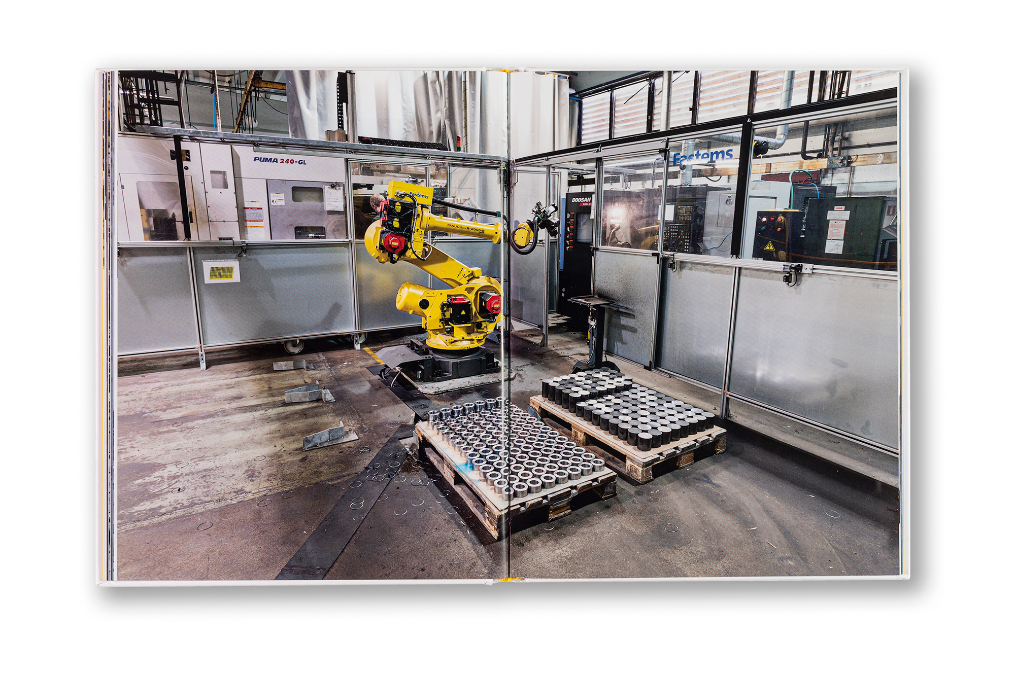
    FMS stands for Flexible Manufacturing System, and Fastems is a Finnish company operating globally in the design and production of intelligent factory automation solutions, primarily for the metal-cutting industry. This book explores contemporary automated factory and storage systems and how they have evolved over the past 30 years. The central idea behind the publication was to showcase the automation solutions of Fastems’ customers. The idea of placing corporate clients in the spotlight and allowing them to speak on your behalf is brilliant. There is nothing more convincing than a satisfied customer willing to share their positive experiences.

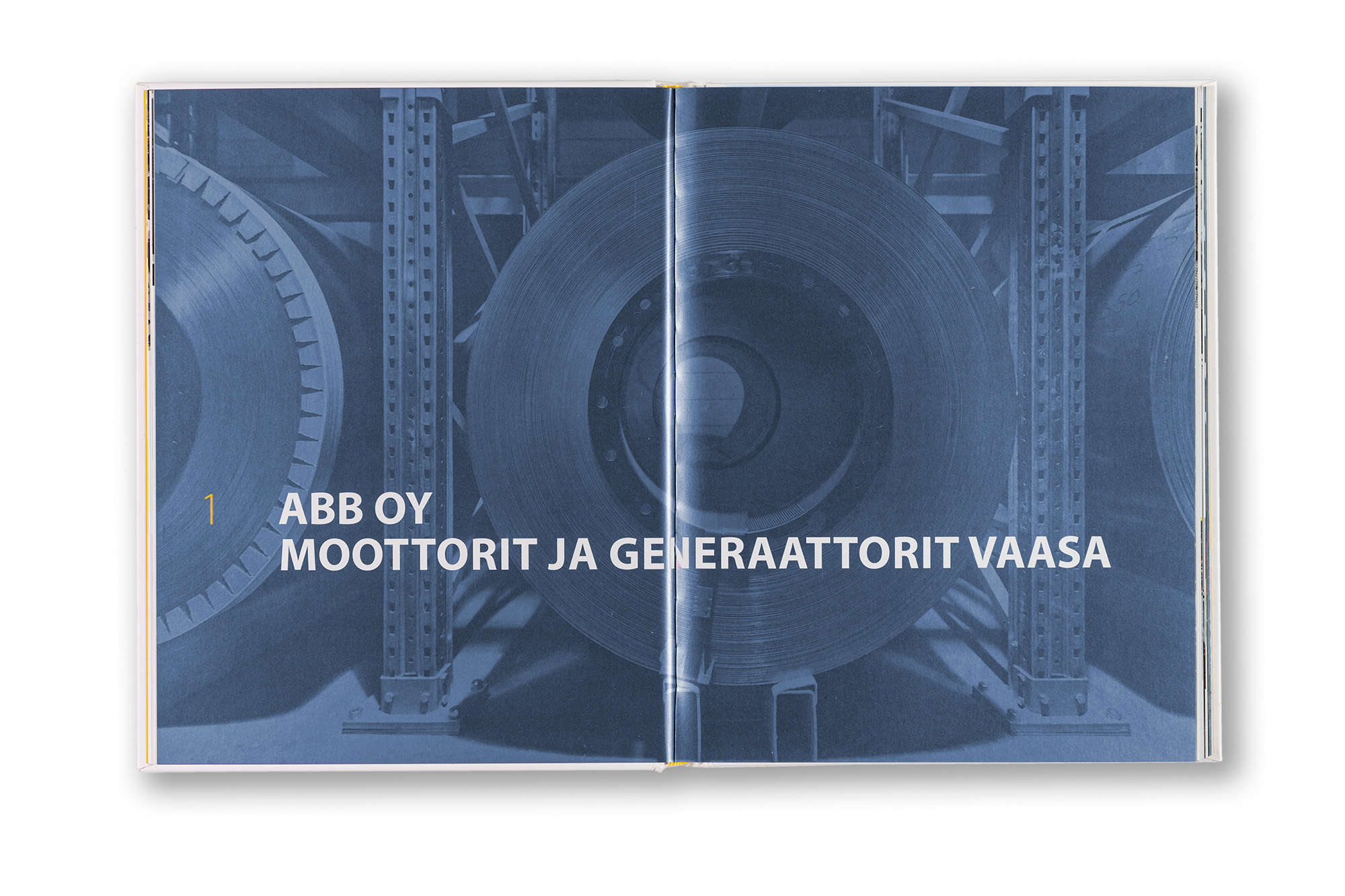
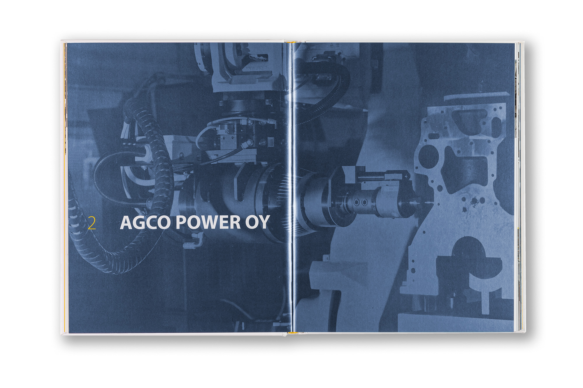
    The book was printed in offset using 4/4 CMYK plus one metallic blue PMS colour. The metallic blue ink is used in headlines and captions, as well as in the full-bleed images that introduce each new chapter. No two columns begin on the same horizontal line, and the column heights vary across the spreads. This creates a visually dynamic rhythm in the body text while at the same time subtly echoing the visual forms of automated factory storage systems. The images also vary in scale and placement throughout the book. I am very pleased with the final appearance of the publication. It is a corporate book with a fresh and distinctive identity. Readability and legibility are at a very high level, and these have always been my primary concerns when setting typography.

    ClientFastems Oyj
    SizePortrait 220 × 283 mm
    Content200 pages
    LanguageFinnish
    BindingSewn binding, Hard cover with matt lamination and hotfoil embossed text.
    PrintingOffset printing CMYK + 1 pms
  10. Helsinki photography biennial

    Leave a Comment

    Concept, typesetting and graphic design.

    This catalogue was produced for the Helsinki Photography Biennial. It presents all participating artists according to the exhibition venues. Each artist was given the same amount of space in the catalogue — one spread consisting of two pages.

    The catalogue is multilingual, containing texts in Finnish, Swedish and English. Because the publication contains a large amount of text and not all language versions could fit comfortably within the same spreads, I decided to place the Swedish texts together at the end of the book as a separate section. The Finnish and English texts appear side by side throughout the catalogue, while the Finnish texts are highlighted with a freely flowing pale green background shape.

    Multilingual publications often present challenges in book design. In general, I prefer to produce separate editions for each language, since readers usually read only one language anyway. When multiple languages appear within the same publication, parts of the book inevitably become irrelevant to individual readers, which is not an ideal situation. However, sometimes compromises have to be made, and exhibition catalogues are, after all, practical publications intended for temporary use.

    I wanted this publication to feel approachable and easy to browse, which is why we chose a softcover format. A deep green colour was used as an accent throughout the book.

    ClientUnion of Artist photographers
    SizeLandscape 210 × 245 mm
    Content132 pages
    LanguageTrilingual: Finnish, English and Swedish
    BindingSewn binding, soft cover with lamination
    PrintingOffset
  11. Väestösuojien rakentamisen historia ja käsikirja 1927–2016 / History & handbook of the Civil shelter building and design

    Leave a Comment

    Project management, concept and graphic design, typesetting, layout, table, chart and diagram design, photo adjustments and CMYK separations, and supervision of the printing process.

    The author of this book, Pekka Rajajärvi, devoted his career to civil shelter construction and design regulations and is regarded as Finland’s leading authority in the field. This book was conceived as his legacy — a way to preserve and share his expertise with future generations working in the field. It is a truly unique publication.

    The book is massive: 432 pages filled with tables, diagrams, charts and regulations. It also contains a large number of photographs and an extensive historical overview of civil shelter construction in Finland as well as internationally.

    The publication contains many old photographs, documentary and spatial images taken by amateur photographers, as well as digitised images reproduced from historical documents and publications. Heterogeneous image material is always challenging to work with. The images required extensive processing, yet the varying quality still remains visible. In a historical publication, however, this can also be seen as part of its character. The book also contains an exceptionally large number of direct quotations from other publications and official documents. For clarity, these quotations were separated from the main text using a grey background.

    Because of the large amount of text, we wanted the book to have a generous format and to avoid densely packed pages. There are wide margins and plenty of space for the elements to breathe. We decided to use bright pink and cyan accent colours as a counterbalance to the heavy regulatory content. The paper stock is bulky Galerie Art Volume 130 g. It feels excellent in the hand, is easy to read and pleasant to the eye, while also enabling high print quality.

    The book was produced at a time when there was intense public debate in the Finnish Parliament about whether the mandatory construction of civil shelters in new buildings should be discontinued for cost reasons. Pekka strongly opposed this idea, and ultimately the requirement remained in place. Now, as the global situation has once again become more unstable, it is easy to see that this was the right decision.

    A USB memory stick was produced alongside the book, containing all the regulations as PDF and Word documents. This publication is essential reading for anyone working in the field.

    ClientPekka Rajajärvi
    SizePortrait 245 × 300 mm
    Content432 pages
    TextsPekka Rajajärvi
    PaperGalerie Art Volume 130 g
    BindingSewn binding, hard cover with soft touch lamination
  12. HVK Ruokapalveluopas [Food Service Handbook]

    Leave a Comment

    Concept of the publication, design and layout, charts, graphs and tables, photography, image adjustments and CMYK separations.

    NESA is a Finnish state own organization that takes care security of supply and ensures a functioning society under all circumstances. This handbook is made for local authorities and communes to help preparing food services for citizens under any circumstances.

    Because this is a practical handbook, I wanted to make it compact in size and easy to use. The publication contains a large number of charts, tables and diagrams. For the paper stock, we selected Munken Polar 120 g, an uncoated natural paper that feels pleasant both to the hand and the eye. The softcover features a soft-touch lamination that gives it a subtle textile-like feel. The primary colour is a natural forest green. The typography is set in NESA’s corporate typeface Beau Sans.

    All photographs were taken by Juha Nenonen, who was also responsible for the design work and CMYK separations.

    ClientNational Emergency Supply Agency NESA / Huoltovarmuuskeskus
    SizePortrait 175 × 248 mm
    Content88 pages
    LanguageFinnish and Swedish (e-PDF version only)
    FontsBeau Sans
    PaperMunken Polar 120 g by Arctic Paper
    BindingSewn binding, soft cover with flaps and lamination
    PrintingOffset + e-PDF
    ISBN978-952-5608-37-3 printed
    ISBN978-952-5608-38-0 PDF
  13. Luova Photo Book Series

    Leave a Comment

    Concept, graphic design, image adjustments and colour separations.

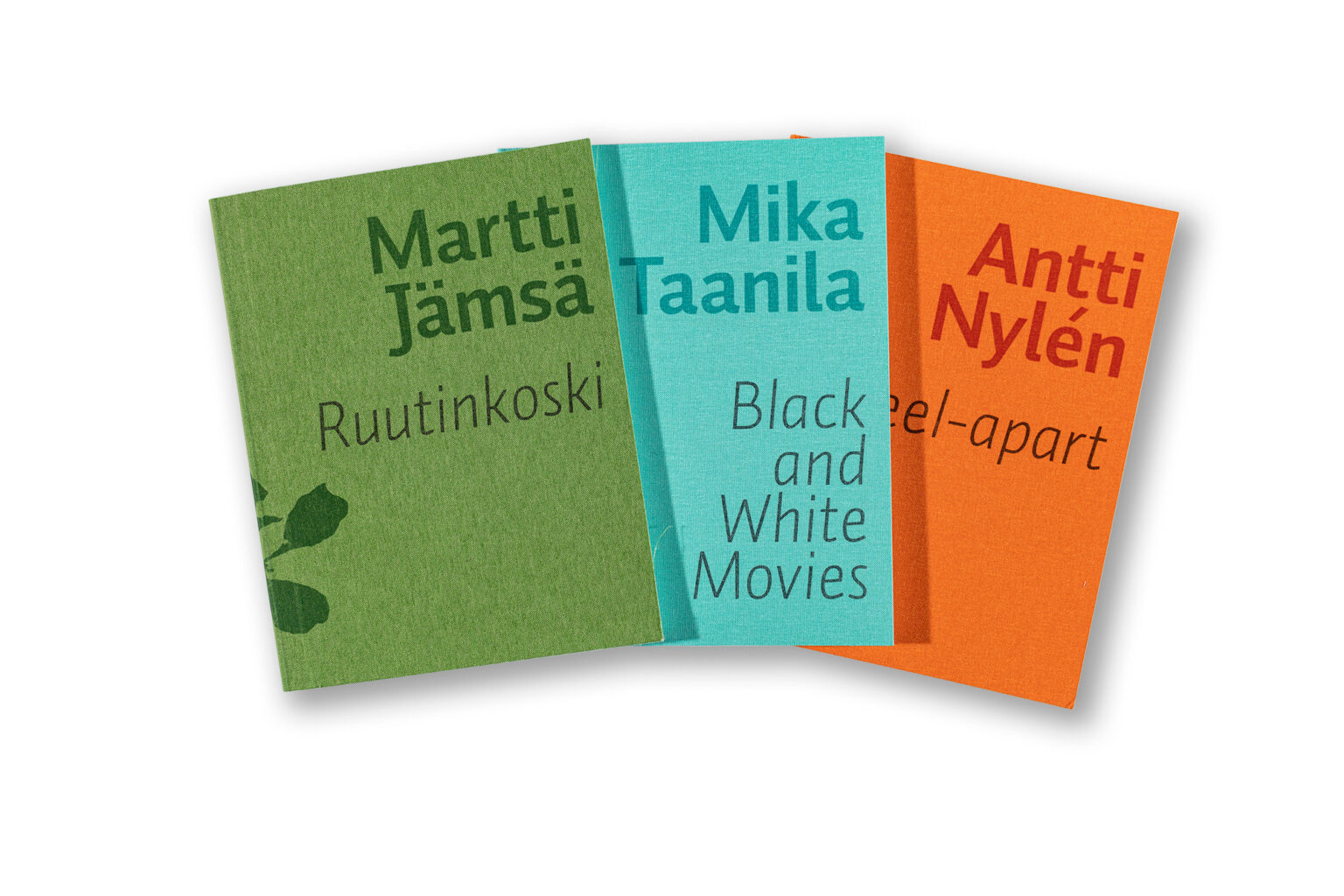
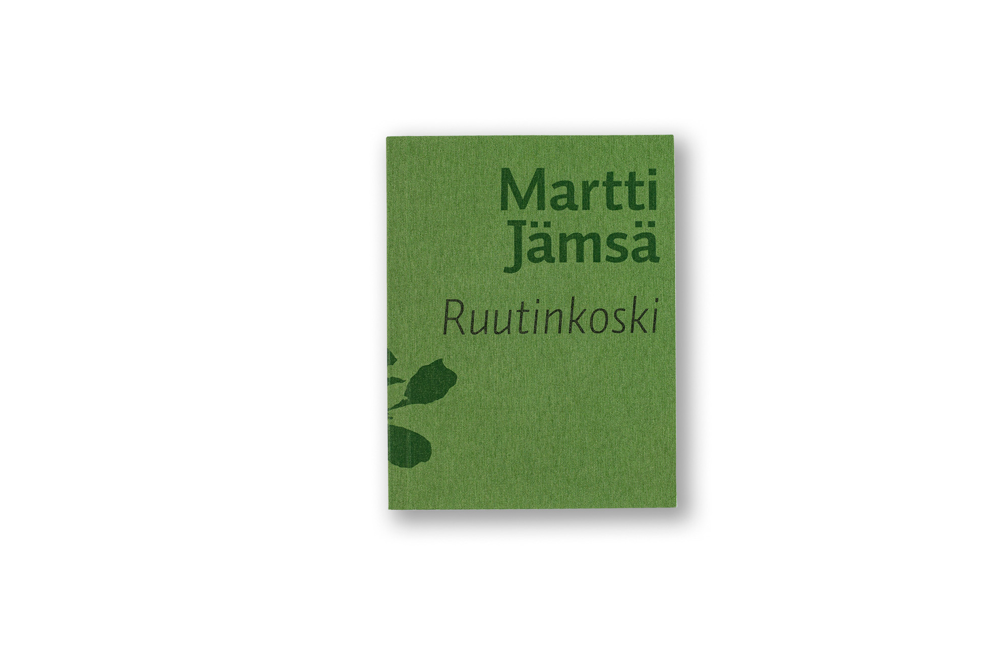
    Luova is a Finnish company specialising in fine art printing and framing for artists. Luova Photo Books is a publication series in which visual artists and photographers can publish their side projects.

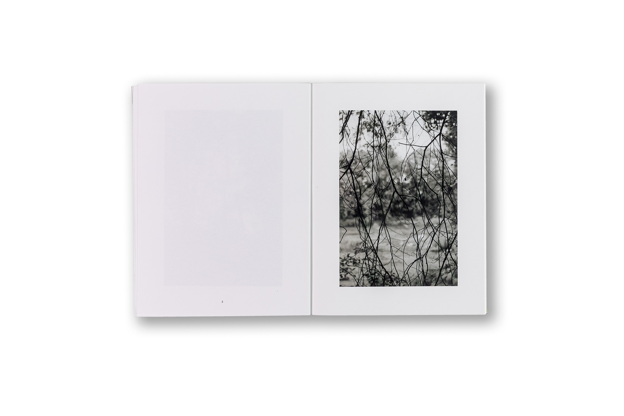
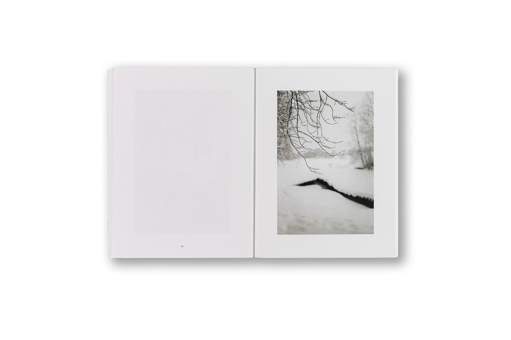
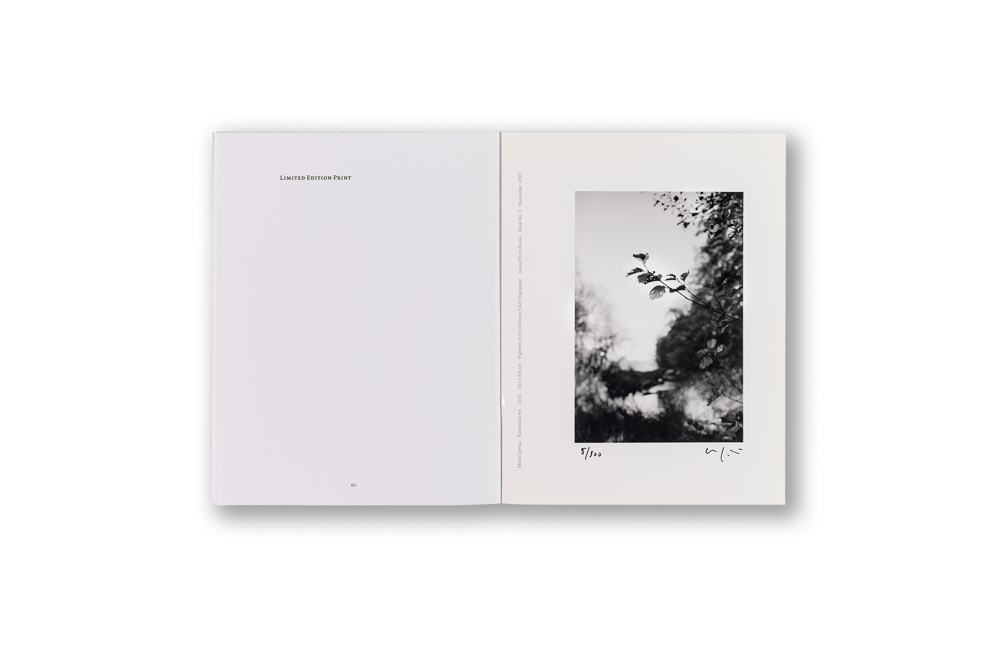
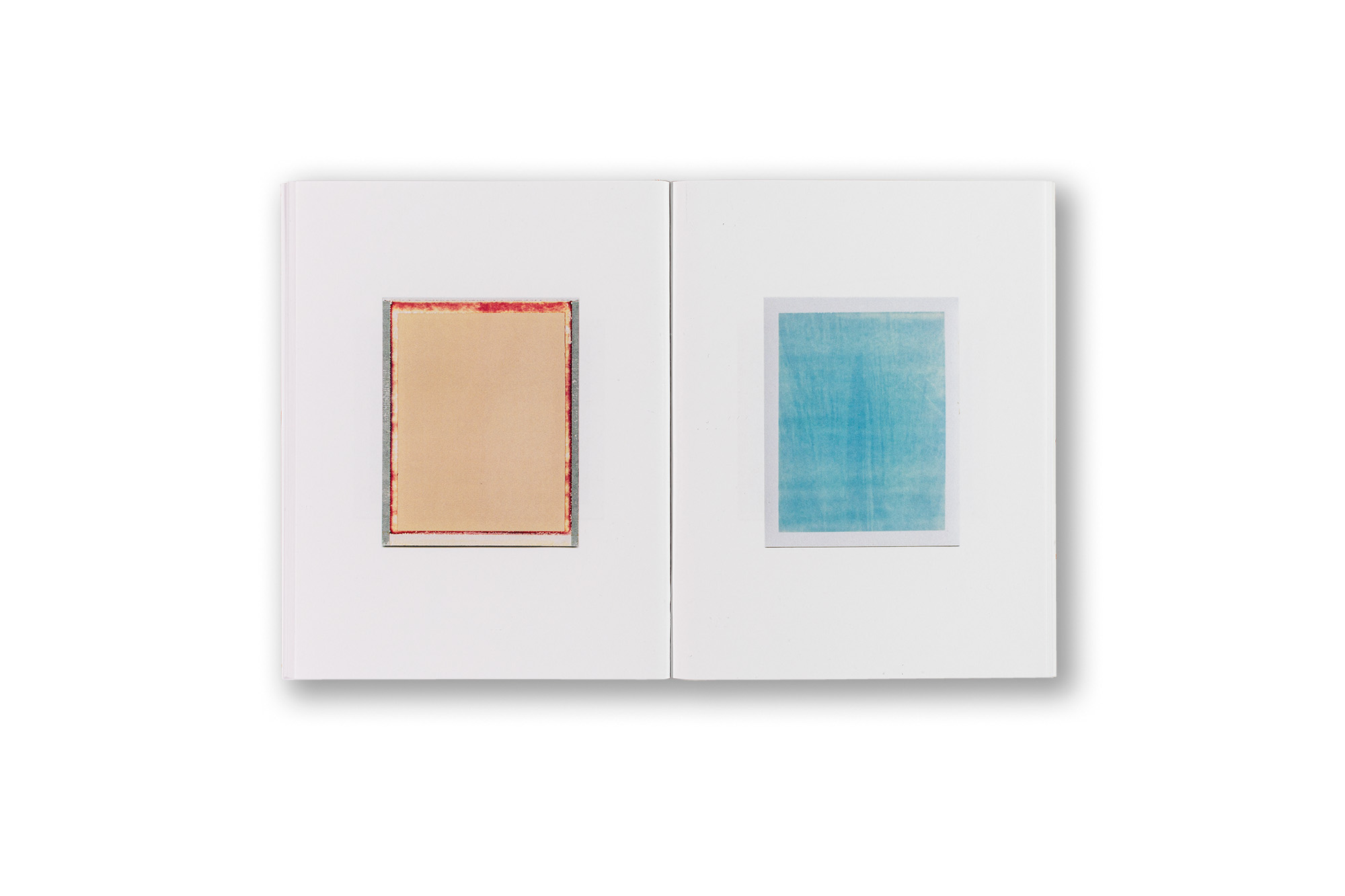
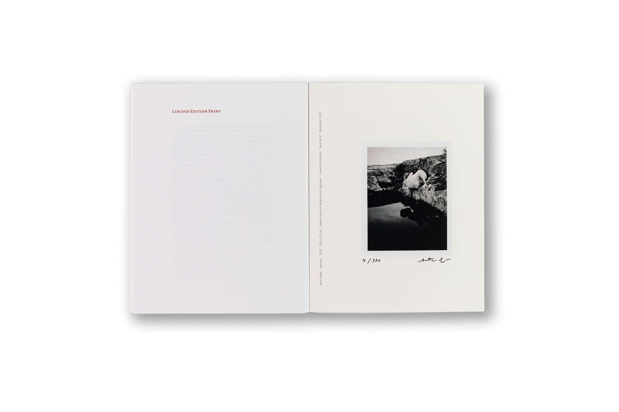
    The concept behind the series was to create small books with soft cloth covers, where the cloth colour varies from one title to another. The books range from approximately 40 to 80 pages. Each edition is limited to 300 copies and includes one collectible pigment print photograph that can be detached from the book along a perforated edge. Every book and collectible print is signed and numbered by the artist. The typefaces used throughout the series are Dolly and Auto by Underware, remaining consistent in every publication. The image layout varies depending on the material. The cover design is always highly minimal, featuring only the name of the artist and the title of the book. The books are digitally printed using either Ricoh or HP Indigo presses and are perfect bound. Each publication contains a text section no longer than two pages.

    This project has been especially enjoyable to work on. Digital printing has made book production far more democratic. One major advantage is that the entire edition does not need to be produced at once, since there are no large start-up costs comparable to offset printing. With HP Indigo, the print quality has become exceptionally good. One challenge, however, has been that perfect binding does not work particularly well with full-spread images.

    I designed the overall book concept, which was developed together with the editorial group. The publisher of the series is Mikko Raatikainen from Luova.

    ClientLuova Helsinki
    SizePortrait 165 × 215 mm
    LanguageEnglish with slip-in folio of translations in Finnish
    FontsAuto and Dolly by Underware
    PaperPaper varies depending on book, Galerie Art Volume 130 g, Arctic Volume or Scandia 2000 smooth white.
    Every book contains one collectible image printed on Museo Silver Rag paper.
    PrintingDigital printing
    Limited edition of 300 copies

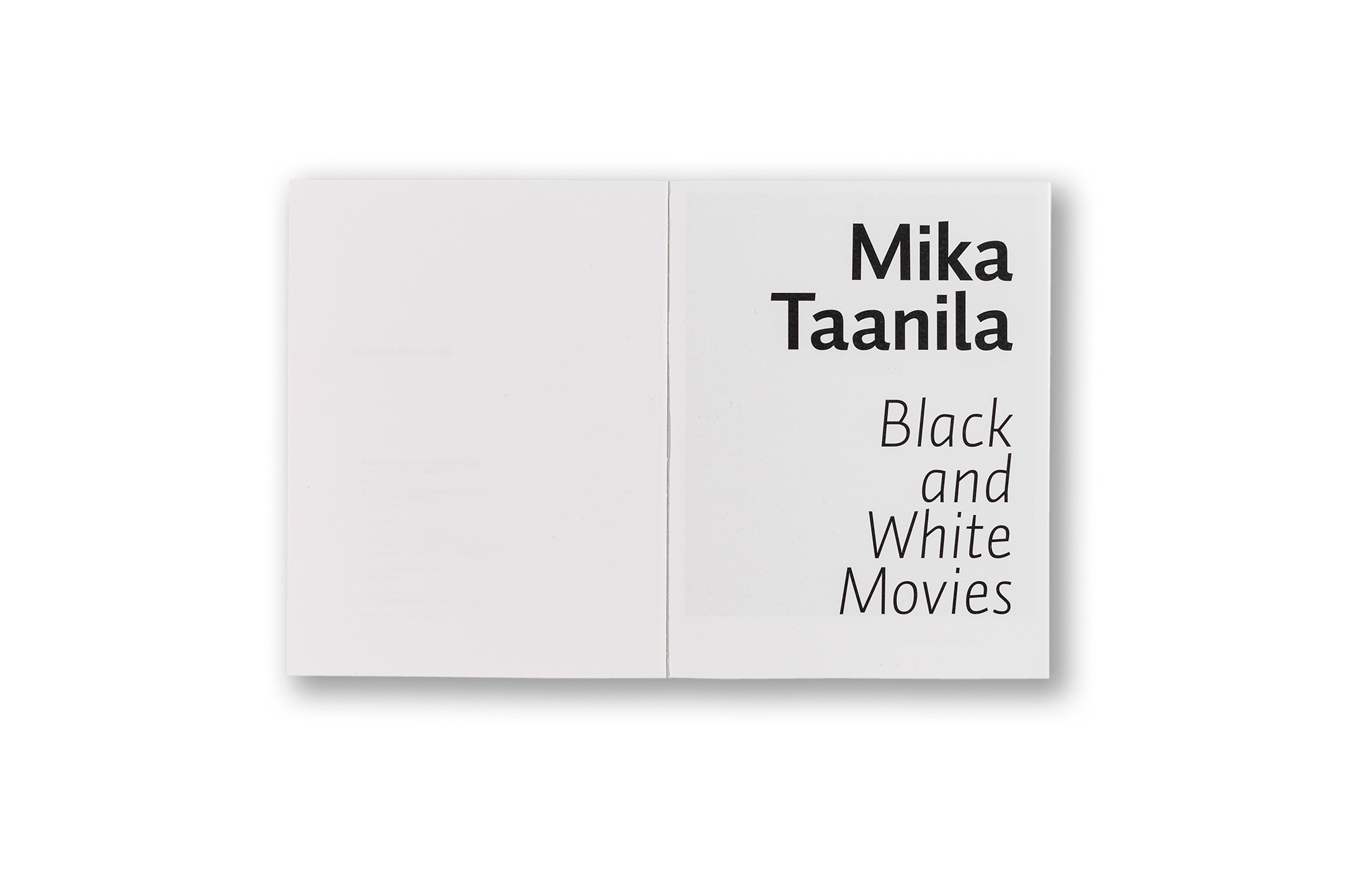
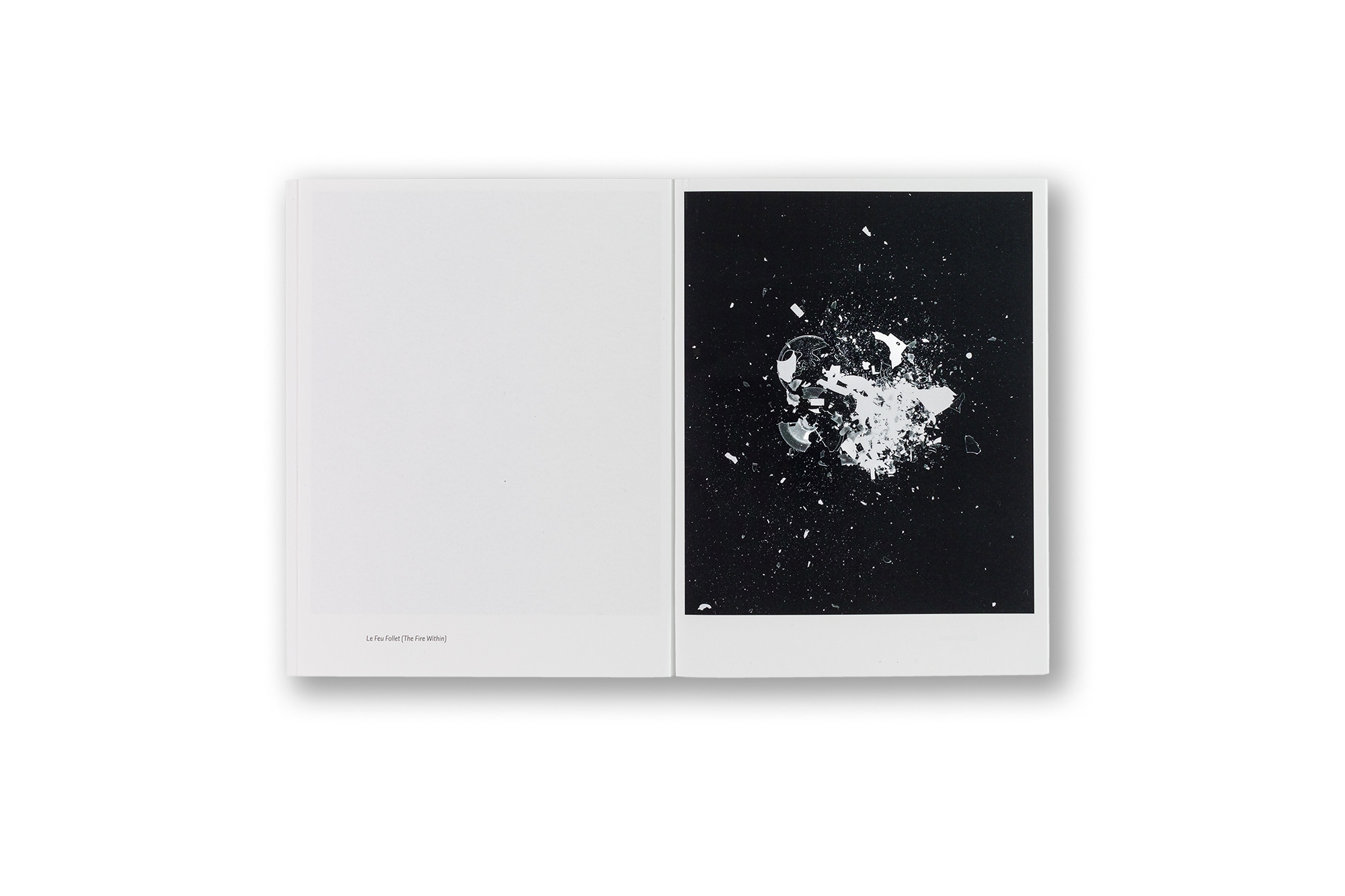
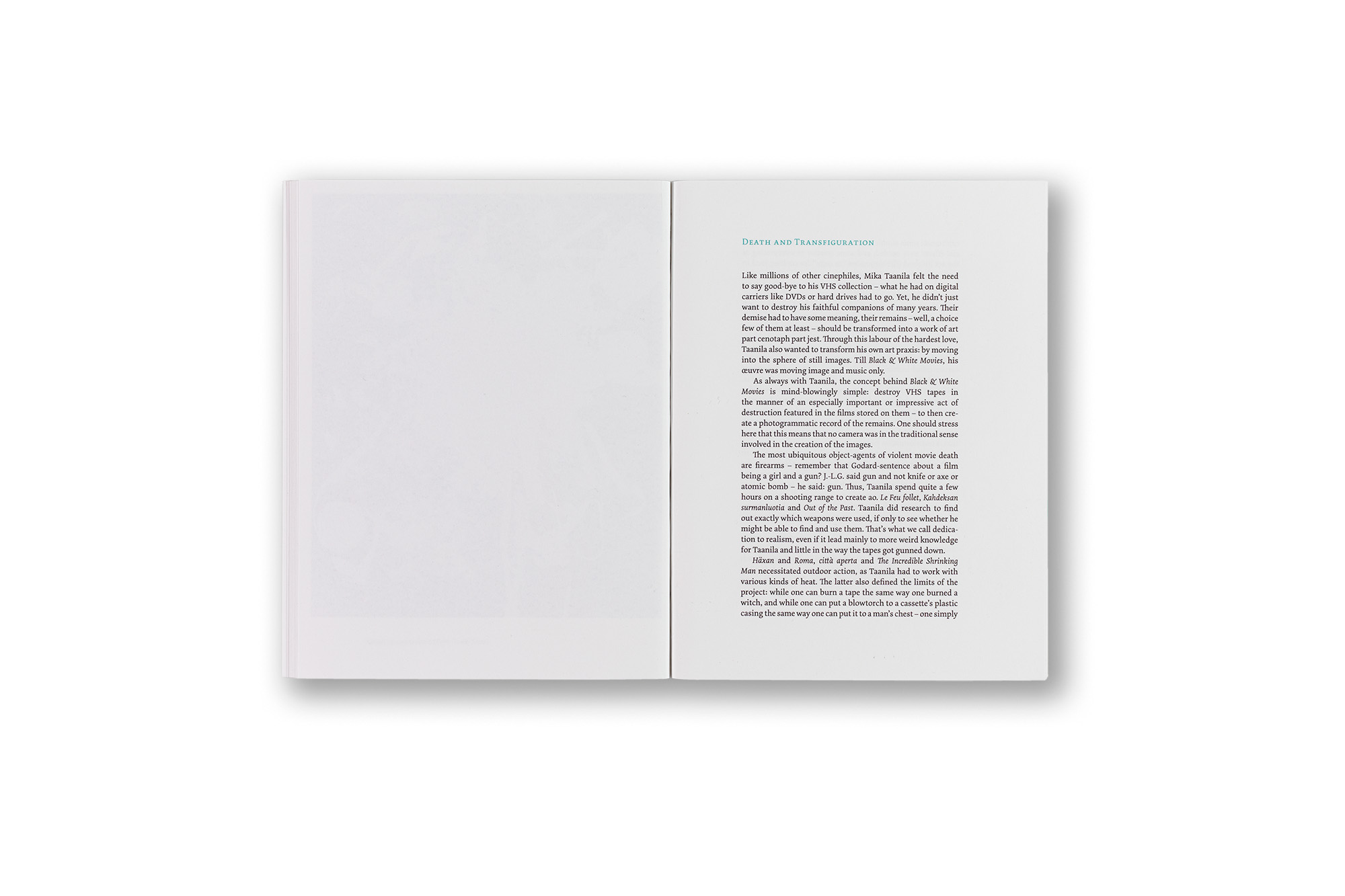
    Black and White Movies

    • Mika Taanila
    • 44 pages
    • Text Olaf Möller
    • ISBN 978-952-5755-05-3

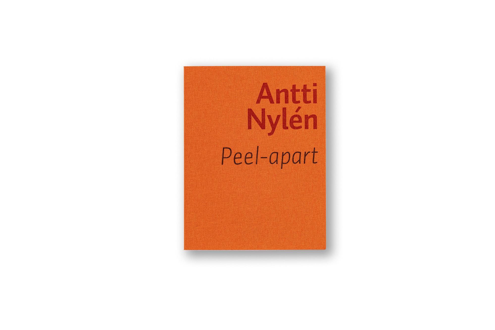
    Peel-apart

    • Antti Nylén
    • 76 pages
    • Text Antti Nylén
    • ISBN 978-952-5755-06-0

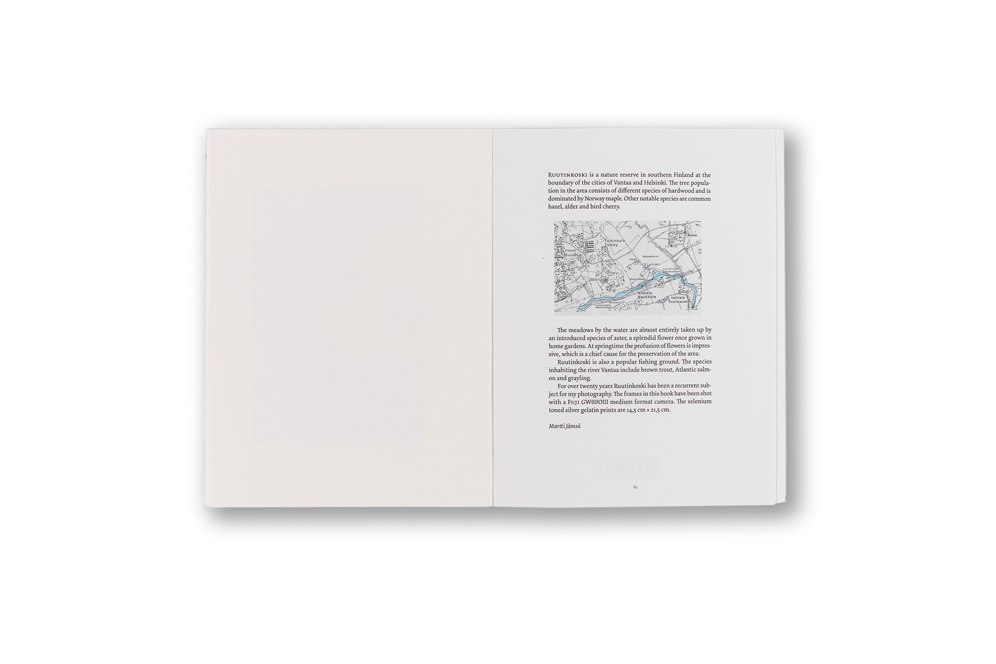
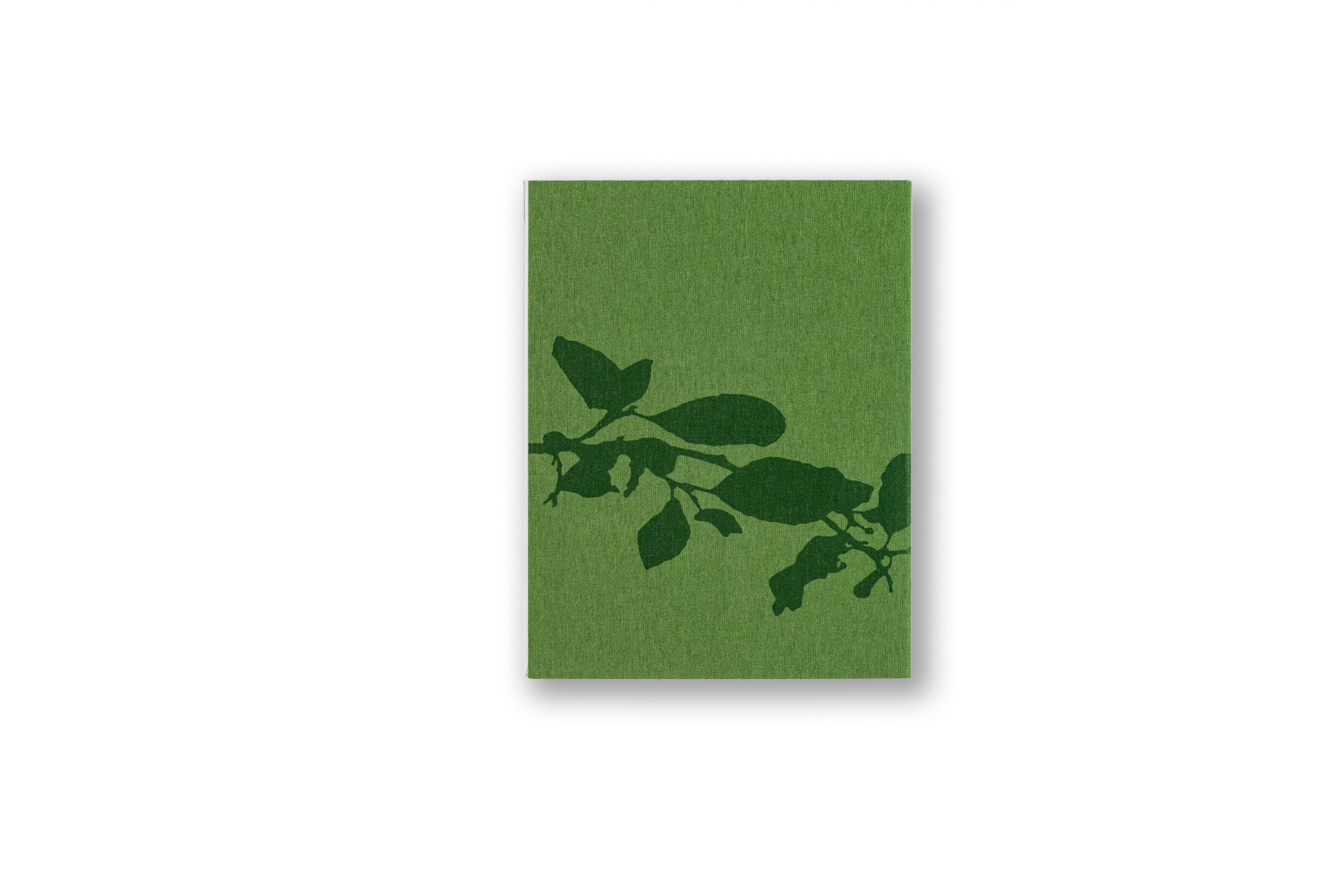
    Ruutinkoski

    • Martti Jämsä
    • 62 pages
    • Text Leena Kuumola
    • ISBN 978-952-5755-07-7

  14. Tunteita ja Tunnelmia tunturimaja Ylläksellä

    Leave a Comment

    Concept of the publication, design / layout, photography, image adjustments and CMYK-separations.

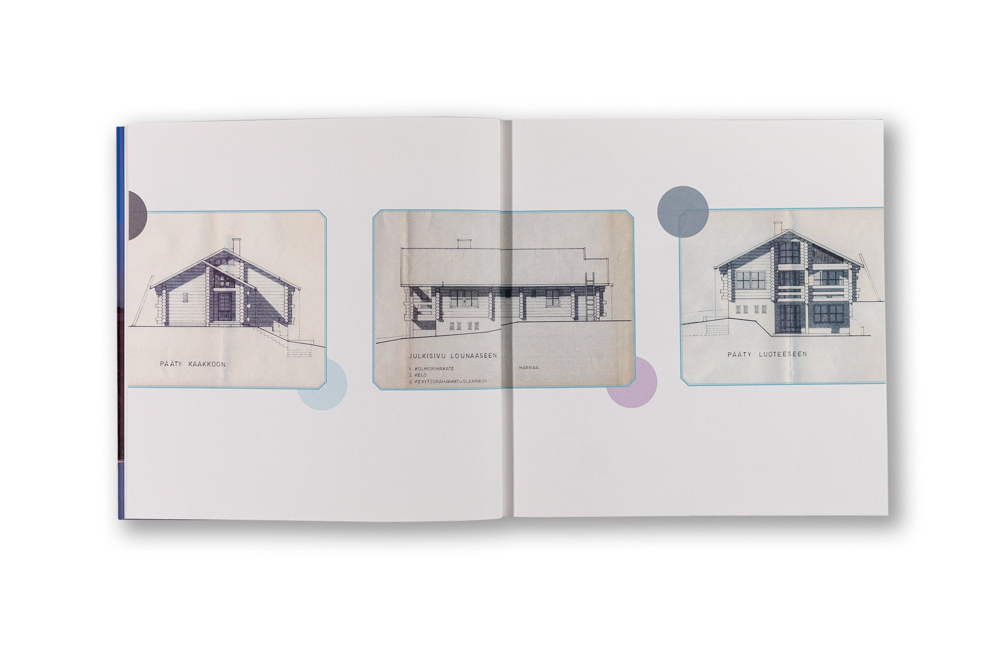
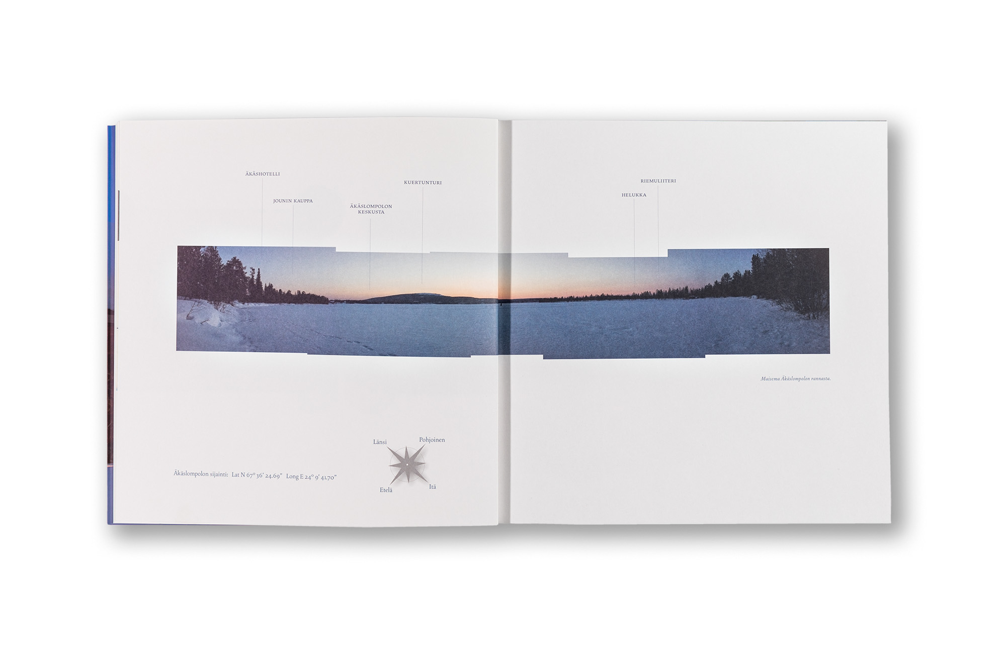
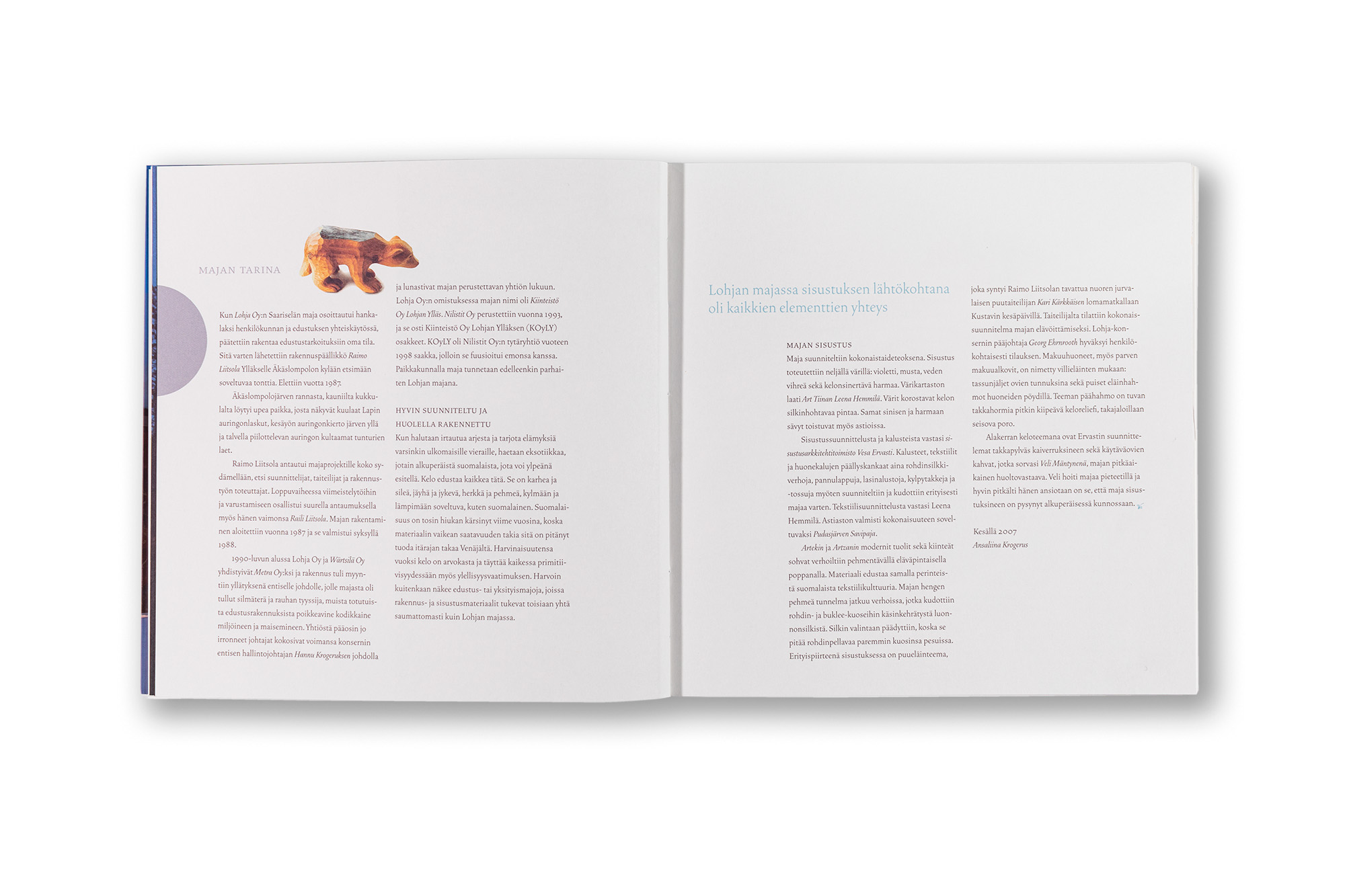
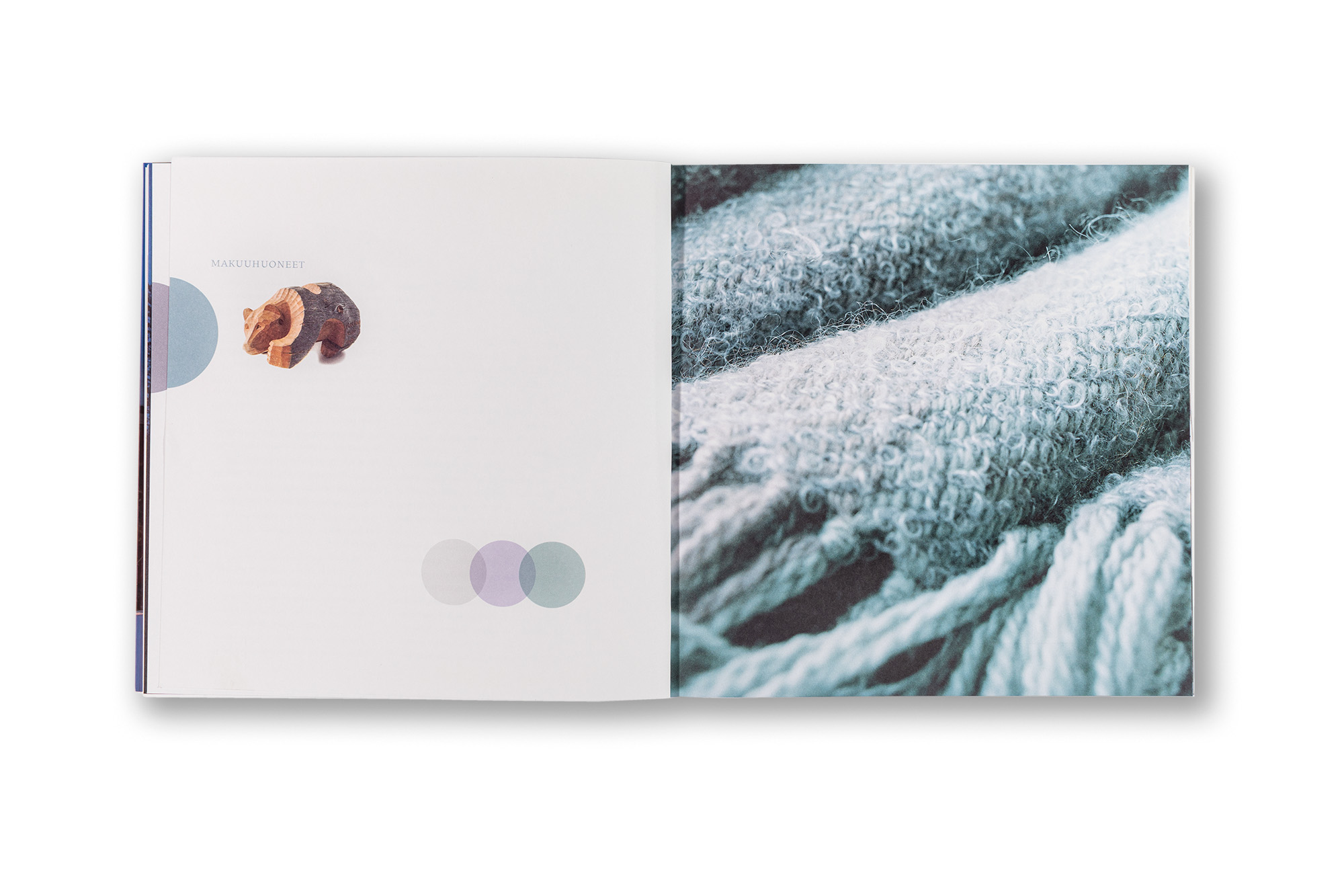
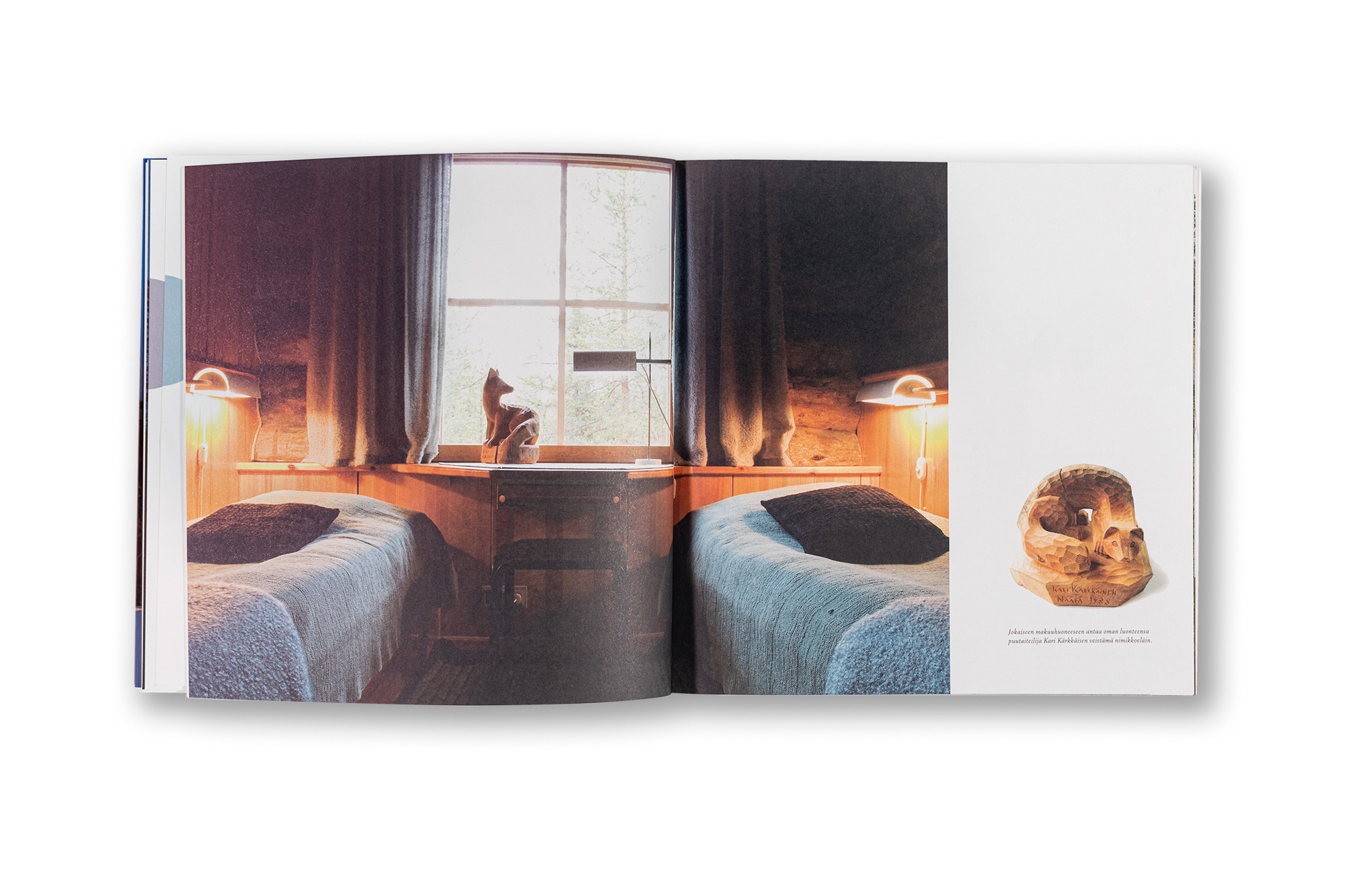
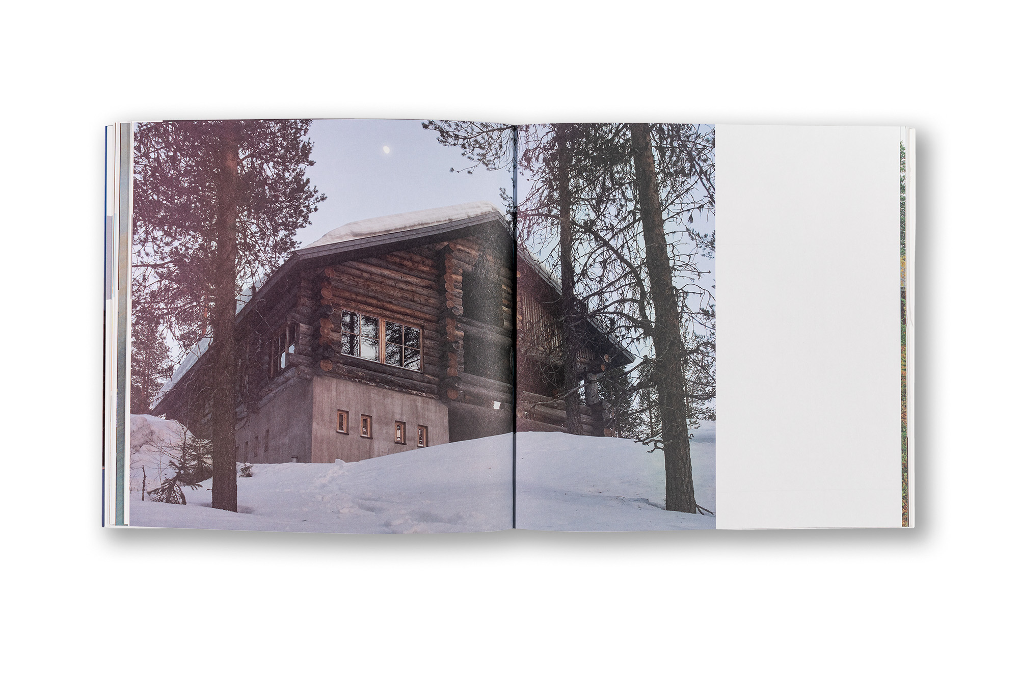
    This is a nice project about private villa in Northern Fell Lapland. The idea of the book was to document the comprehensive design of the villa. All the textiles and even the tableware were designed custom made just for this villa.

    Because it was very much aboit material, textiles and feelings I wanted to give this book nice soft and haptic feel. Content paper is uncoated Munken Lynx 170 g and the cover is Invercote creato matt. The book has a softcover with lamination. The type is set with John Downer’s beautiful Vendetta by Emigre fonts. Very nice project to do.

    ClientAdelec Hiljahousing
    PhotographyNiclas Warius
    Size228 × 228 mm
    LanguageFinnish
    FontsVendetta by Emigre
    PaperMunken Lynx 170 g by Arctic Paper / Papyrus, Invercote creato matt by Antalis for the cover.
    BindingLaminated softcover with flaps